Abstraction
Abstraction in my own opinion is a view that is not understood immediately something that requires time to see what the image represents
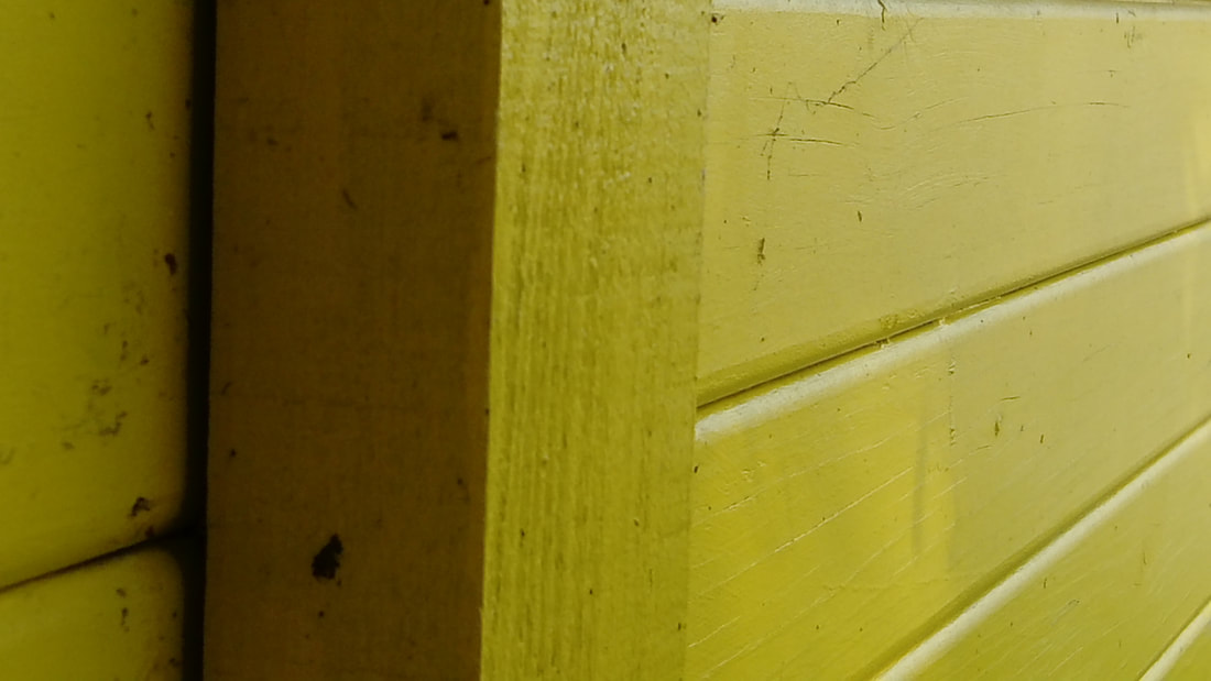
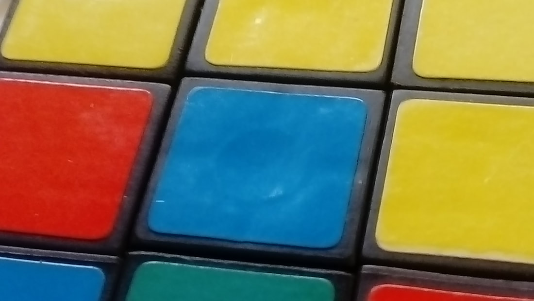
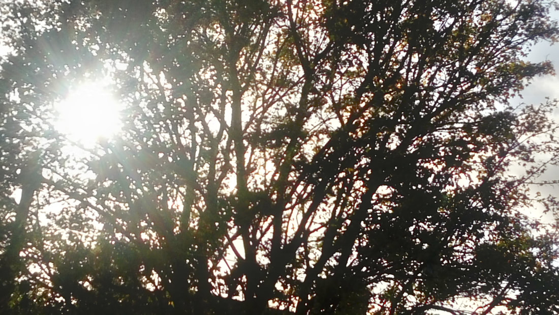
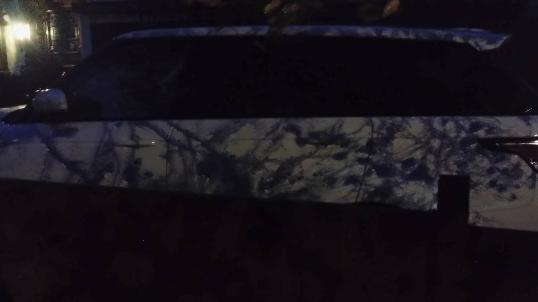
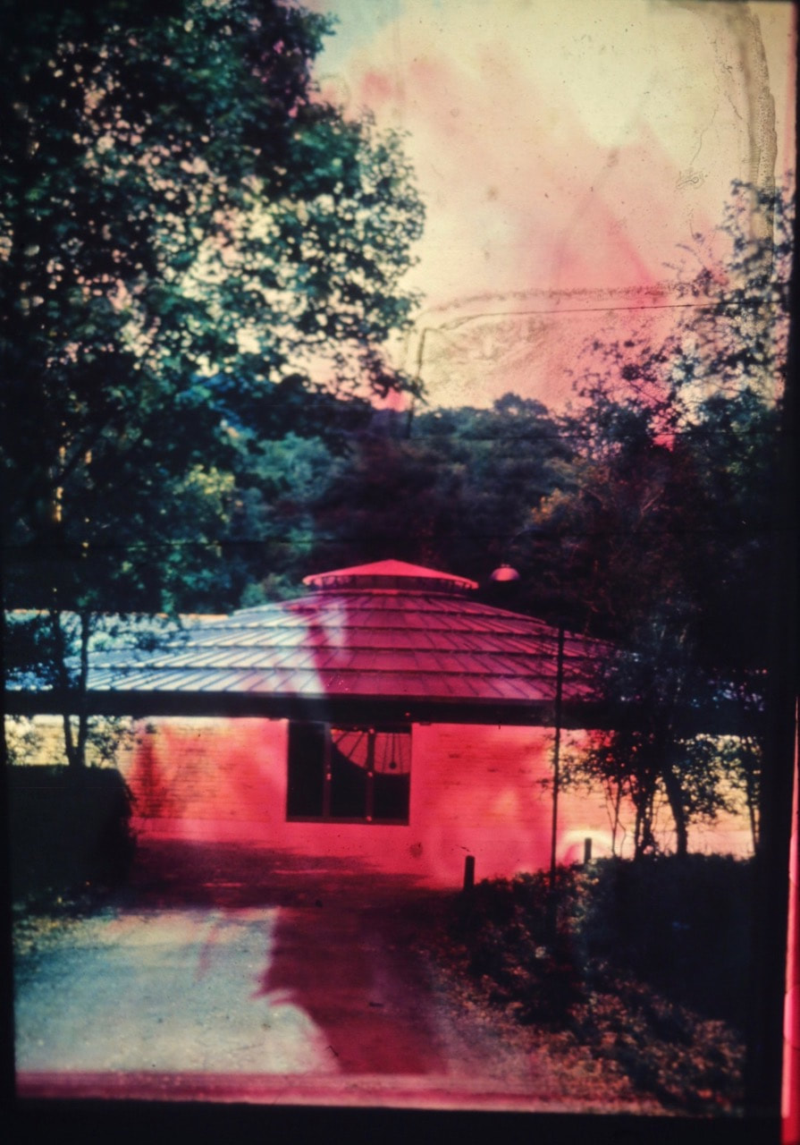
Focus: Which areas appear clearest or sharpest in the photograph? Which do not?
Light: Which areas of the photograph are brightest? Are there any shadows? Does the photograph allow you to guess the time of day? Is the light natural or artificial? Harsh or soft? Reflected or direct?
Line: Are there objects in the photograph that act as lines? Are they straight, curvy, thin, thick? Do the lines create direction in the photograph? Do they outline? Do the lines show movement or energy?
Repetition: Are there any objects, shapes or lines which repeat and create a pattern?
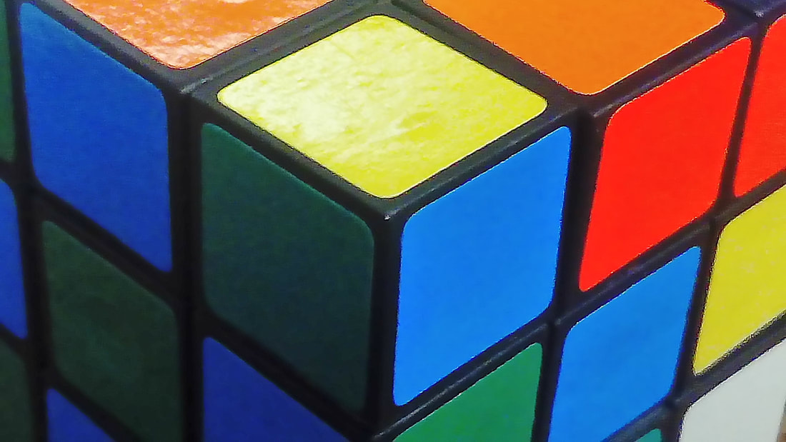
Shape: Do you see geometric (straight edged) or organic (curvy) shapes? Which are they?
Space:s there depth to the photograph or does it seem shallow? What creates this appearance? Are there important negative (empty) spaces in addition to positive (solid) spaces? Is there depth created by spatial illusions i.e. perspective?
Texture: if you could touch the surface of the photograph how would it feel? How do the objects in the picture look like they would feel?
Value/Tone: Is there a range of tones from dark to light? Where is the darkest value? Where is the lightest?
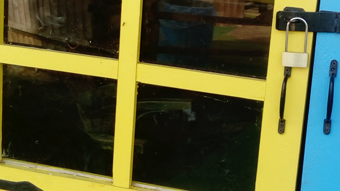
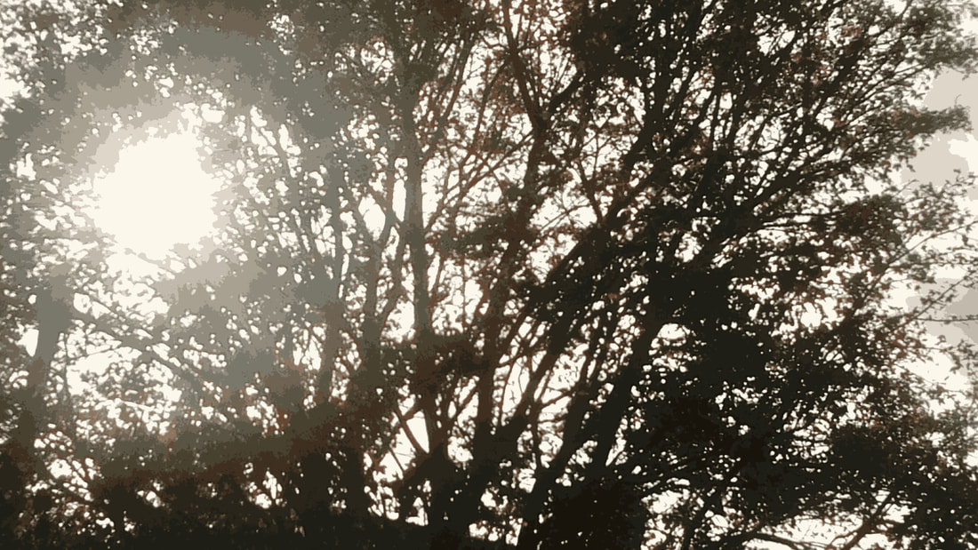
Light: Which areas of the photograph are brightest? Are there any shadows? Does the photograph allow you to guess the time of day? Is the light natural or artificial? Harsh or soft? Reflected or direct?
Line: Are there objects in the photograph that act as lines? Are they straight, curvy, thin, thick? Do the lines create direction in the photograph? Do they outline? Do the lines show movement or energy?
Repetition: Are there any objects, shapes or lines which repeat and create a pattern?
Shape: Do you see geometric (straight edged) or organic (curvy) shapes? Which are they?
Space:s there depth to the photograph or does it seem shallow? What creates this appearance? Are there important negative (empty) spaces in addition to positive (solid) spaces? Is there depth created by spatial illusions i.e. perspective?
Texture: if you could touch the surface of the photograph how would it feel? How do the objects in the picture look like they would feel?
Value/Tone: Is there a range of tones from dark to light? Where is the darkest value? Where is the lightest?
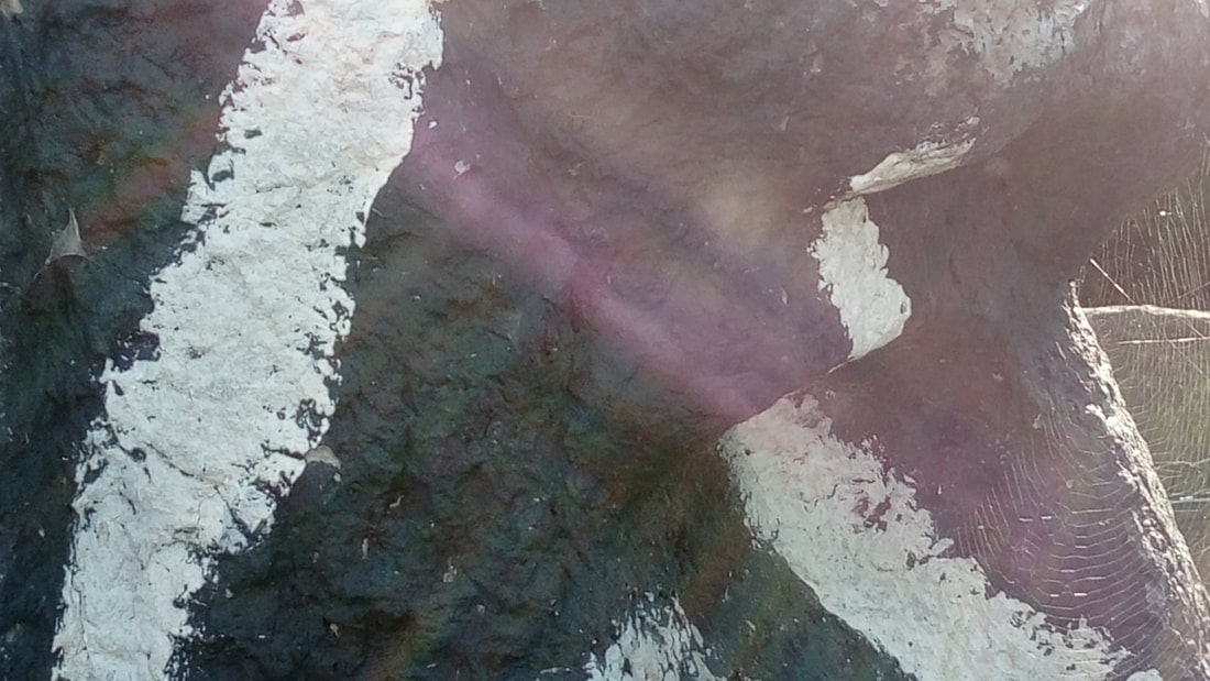
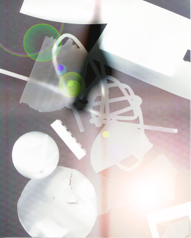
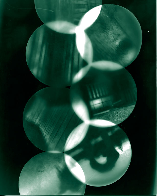
Photogram
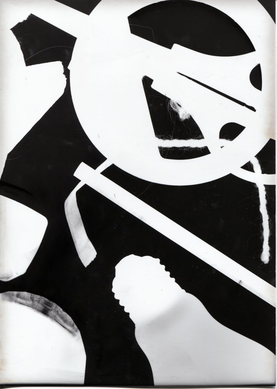
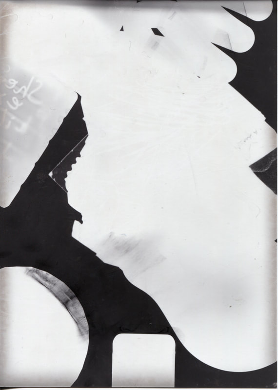
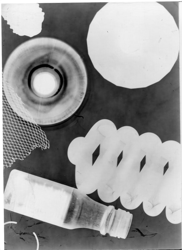
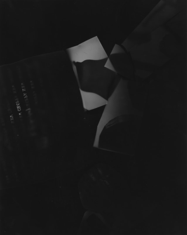
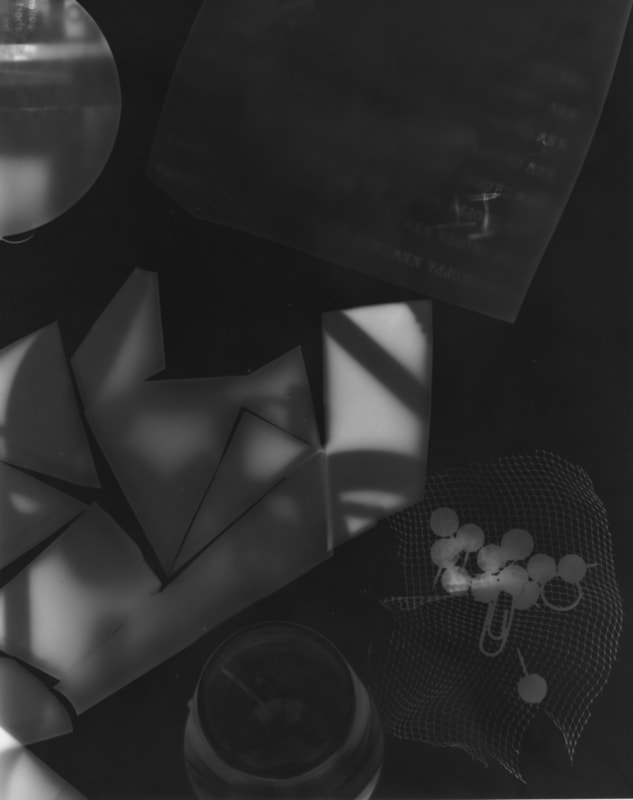
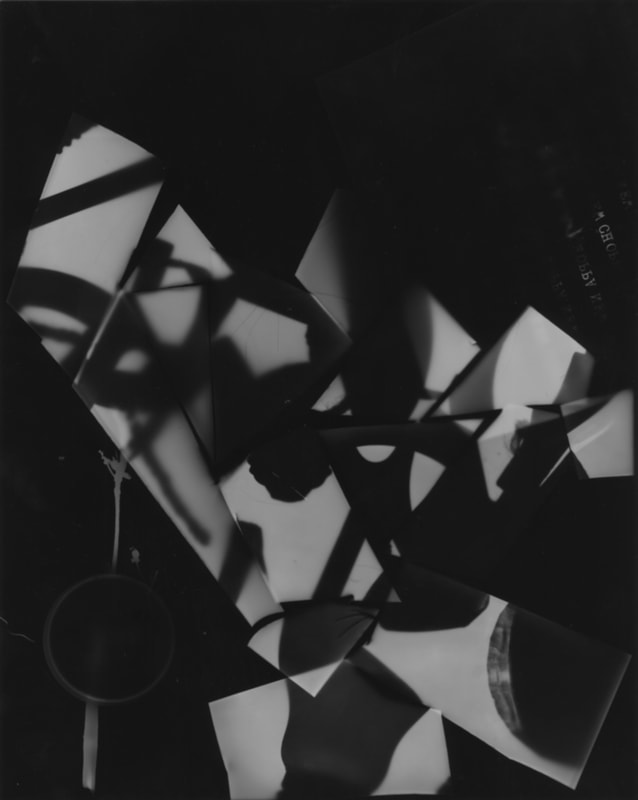
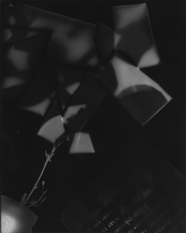
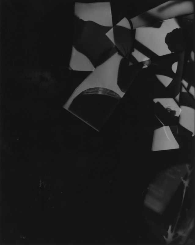
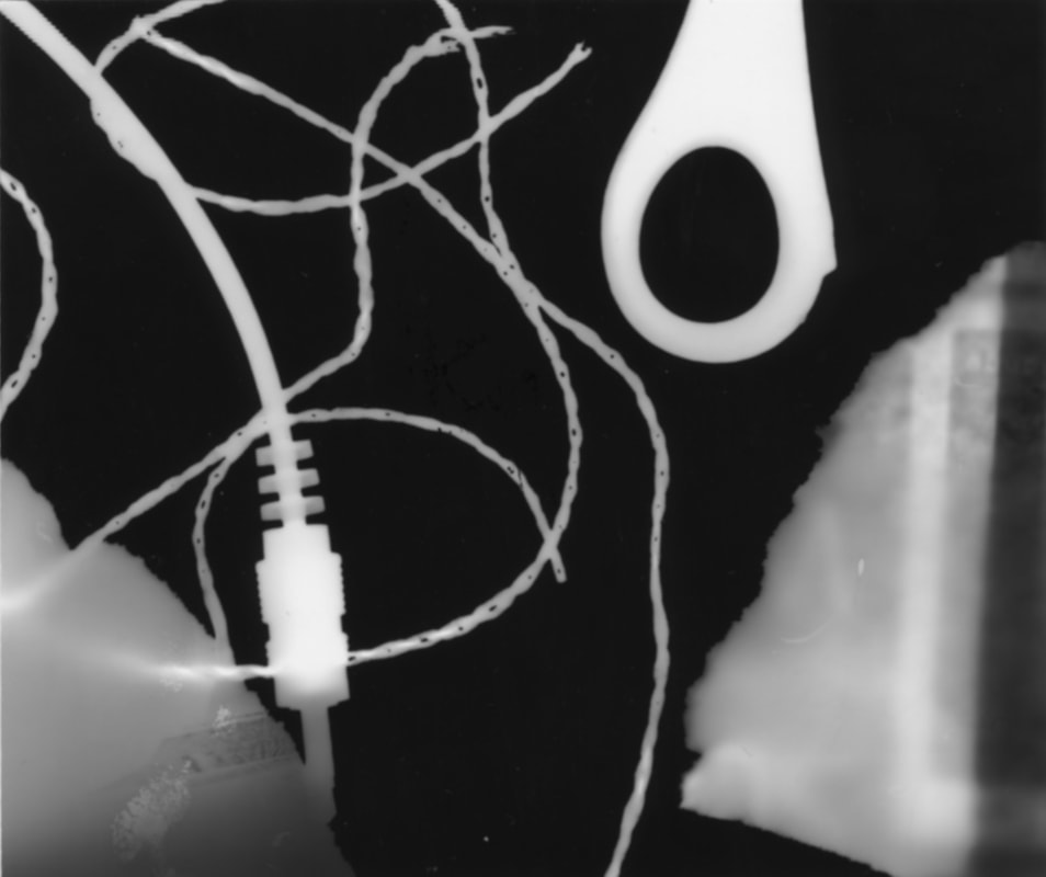
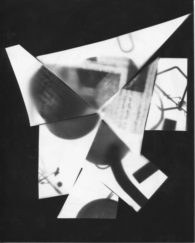
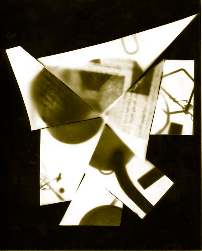
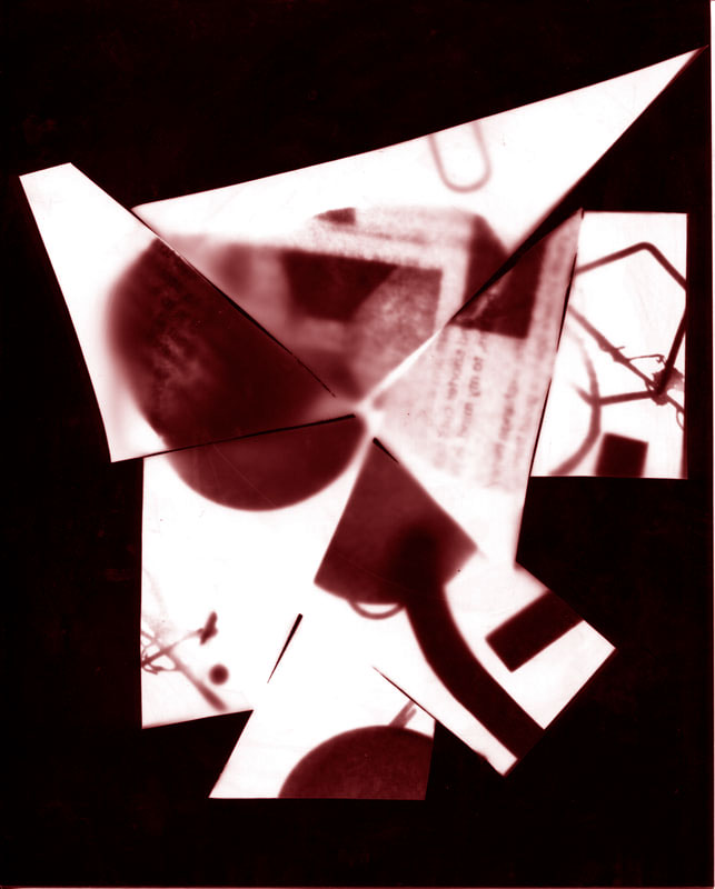
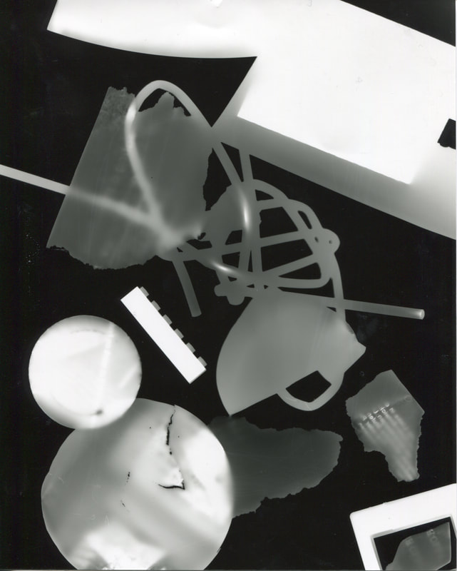
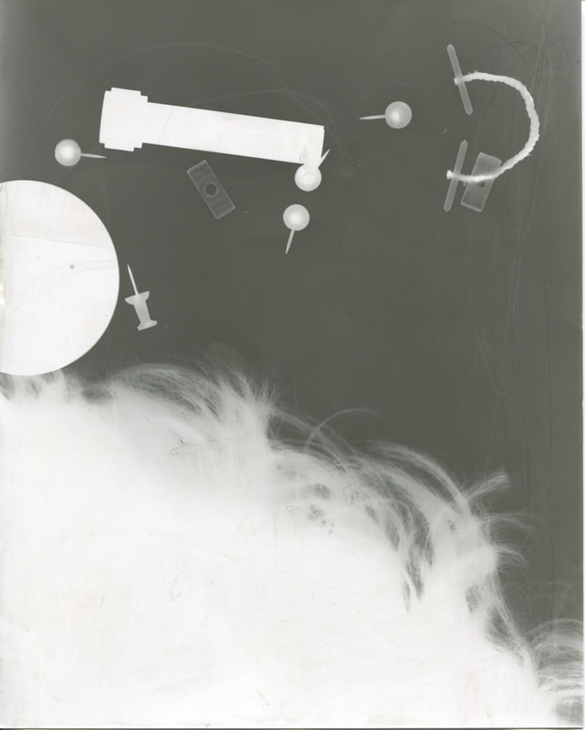
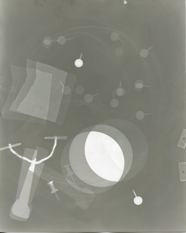
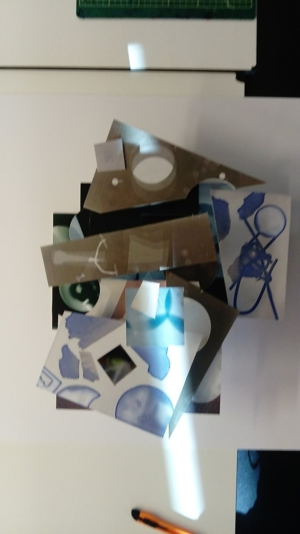
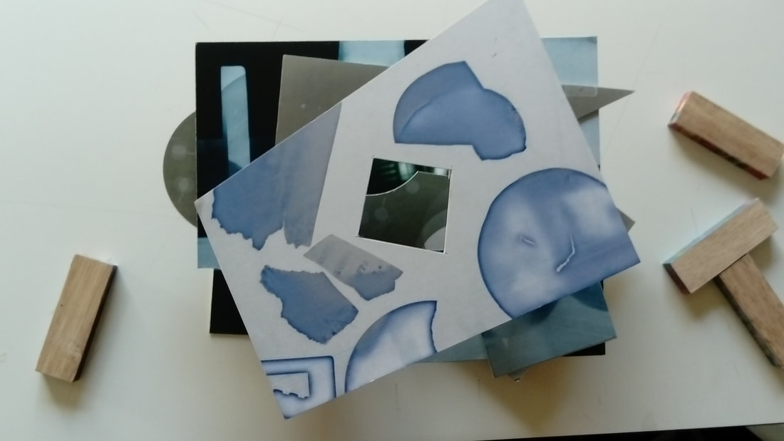
A photogram is made from a light sensitive paper but without a camera. I have used photograms to make multiple images I had lost my favourite one but have put one that is similar. For most of the images, I added a piece of paper for a chance of seeing it and I succeeded and it looks nice and mysterious as its slightly blurred. I had to cut up a photogram to pieces and stick it back together I don't like it in a regular square so I stuck it together with no outer shape in mind only what the image.
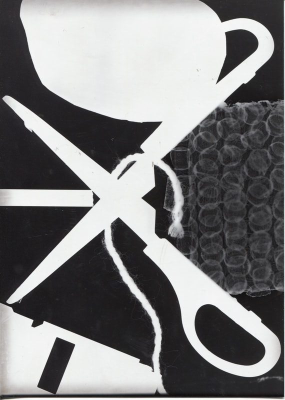
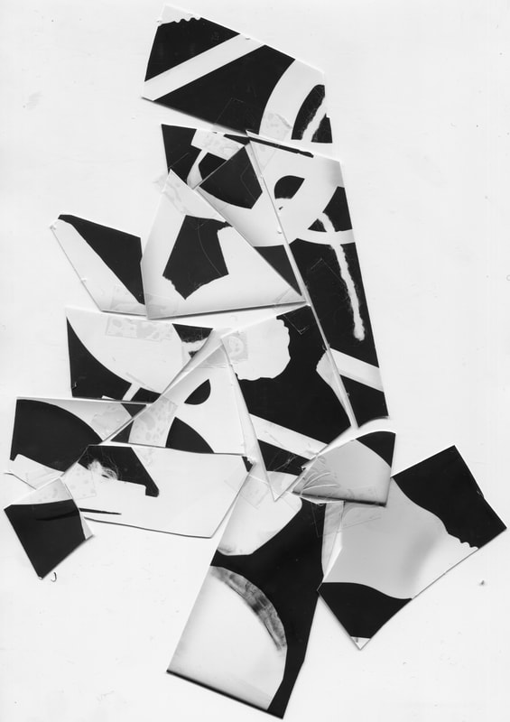
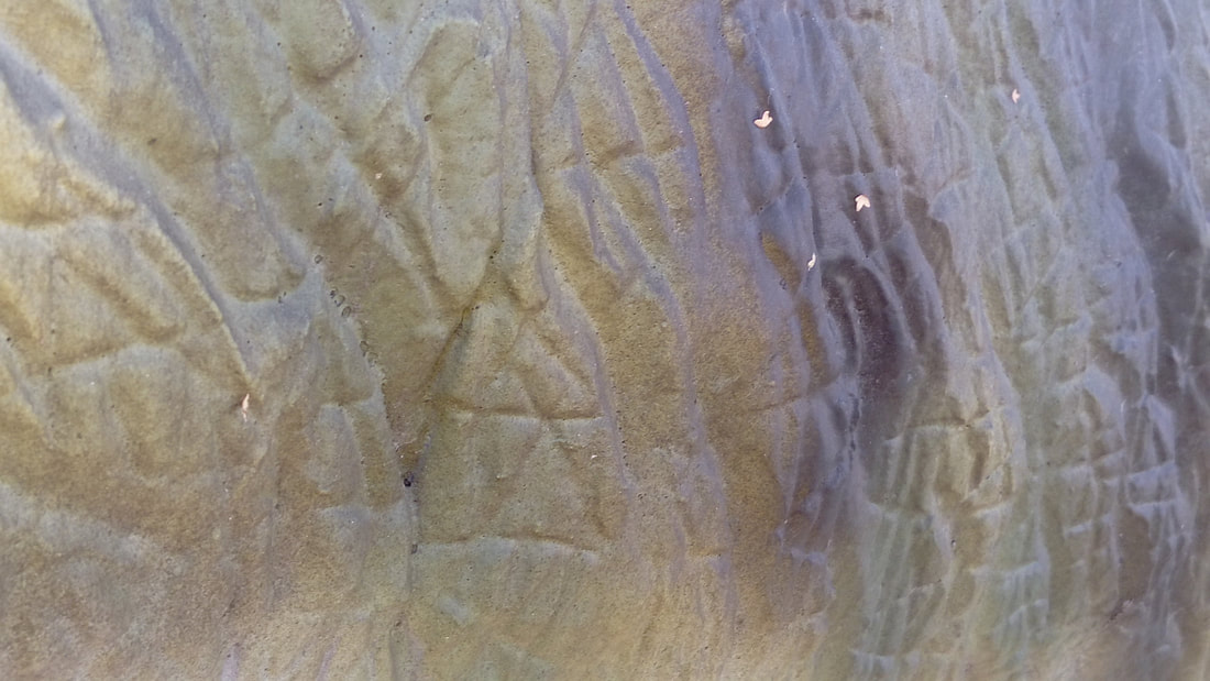
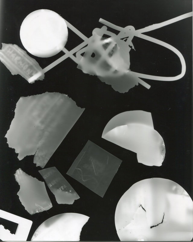
Cut-Up Photograms
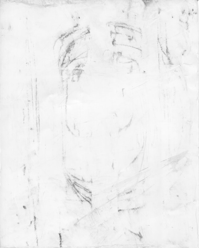
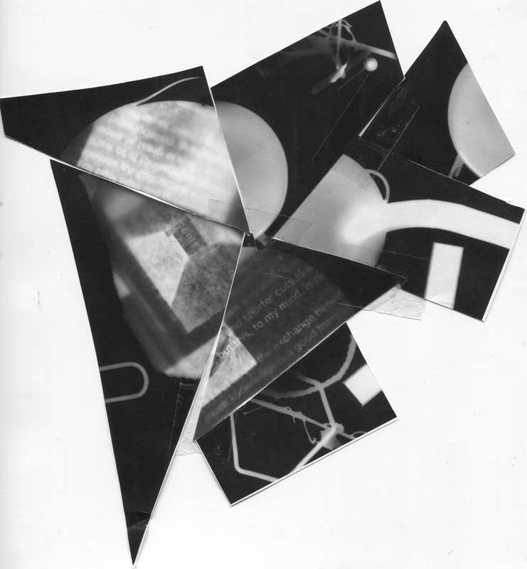
These are photograms that have been severed into pieces they are both the same image however the right one seems to be due to a lack of chemicals to develop the photogram but it is very abstract as at first you cannot tell what it is within it does look like a drawing made or a draft of a forest which is what I can see but on the left image it has a ghastly effect with a bunch of newspapers which can be very mysteries in the way that no one can tell what is happening. I like to see the story behind a person through it like the person is a detective who had a childhood in the beach.
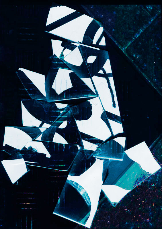
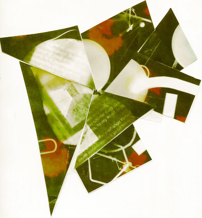
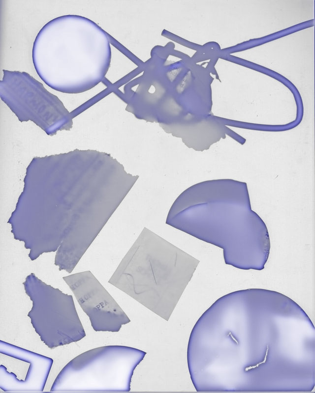
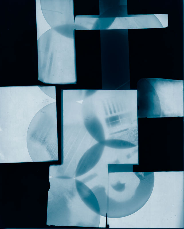
Duotype Photogram
Duotypes are made by in photoshop where it acts similarly to printing where two colors would be put over the image such as yellow and black.
For Duotypes there is one difference between all three images is the colour. But these give different feelings towards them such as yellow is mushy and kind of boring to look at but does give the sense of an old image. Blue in my opinion is more interesting it gives it a darker outline of a shaper colour while being clear to see the image.
For Duotypes there is one difference between all three images is the colour. But these give different feelings towards them such as yellow is mushy and kind of boring to look at but does give the sense of an old image. Blue in my opinion is more interesting it gives it a darker outline of a shaper colour while being clear to see the image.
Overlayed Images
I had put in so duotypes that were overlayed with the opacity being down to being merged with the photo
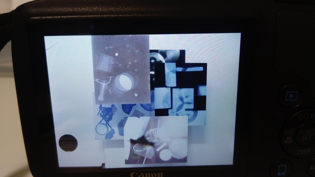
Abstraction Photobook
The new work set is too create a photobook that contains abstraction. I feel as it could be possible for me to make a sub-genre as colors as to mix it up either to is only black and white or make a strange and colorful pictures or I could layer a black and white photo with colours the way I will use to make the photobook is -----------
I have looked for some pages, and one of my favorite is five techniques for creating abstract photography as some newer techniques I found such as panning or zoom blur sound interesting and easy to do which could help a lot.
I have been testing out an easily accessible photo book app and gives one 20 page photobook for free per month with only delivery cost at £6 which is pretty good (even if delivery is really high) it gives access to change the background give a front page a photograph and title to any captions wanted photos could be easily rotated to fit page it can also be enlarged but not the best option in my opinion. The back cover can also be given a photograph the only thing I would want is a choice to have less than 20 pages but its not possible through what I checked. It may be an option I should be considering when I think of how to make the photobook.
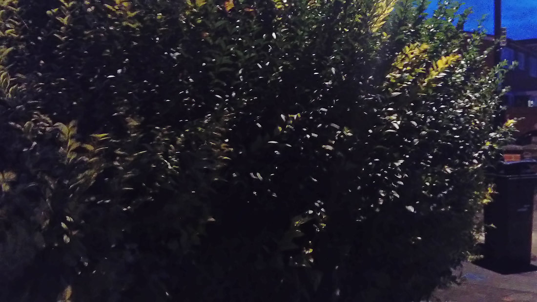
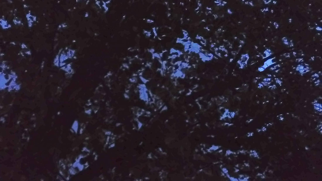

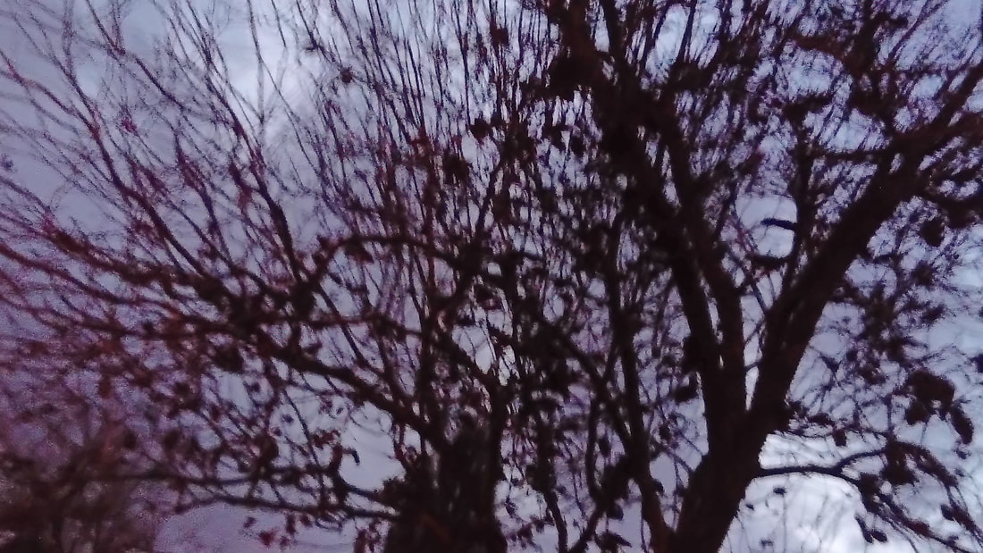
This is one of the most successful as the out of focus blur gives off a ominous effect and the contrast works very well as the tree is very dark but the background is very light and it is very difficult to see the bird in the lower middle and when glanced at it can not be very associating with the tree in a night.
Possible Image?
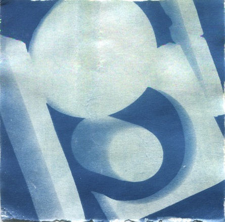
I found an old cyanotype from the beginning of year 9 that I found could be abstract it is visually pleasing to look at and could come as a base to how I should be making abstract photographs as I still feel as this was definitely one of the best photos that I have made in the year that I began in photography.
Assessment
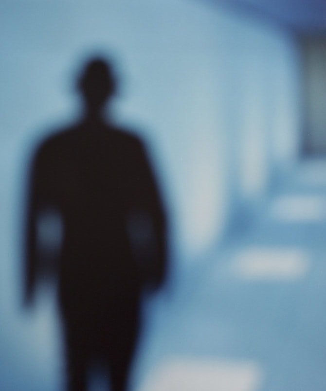
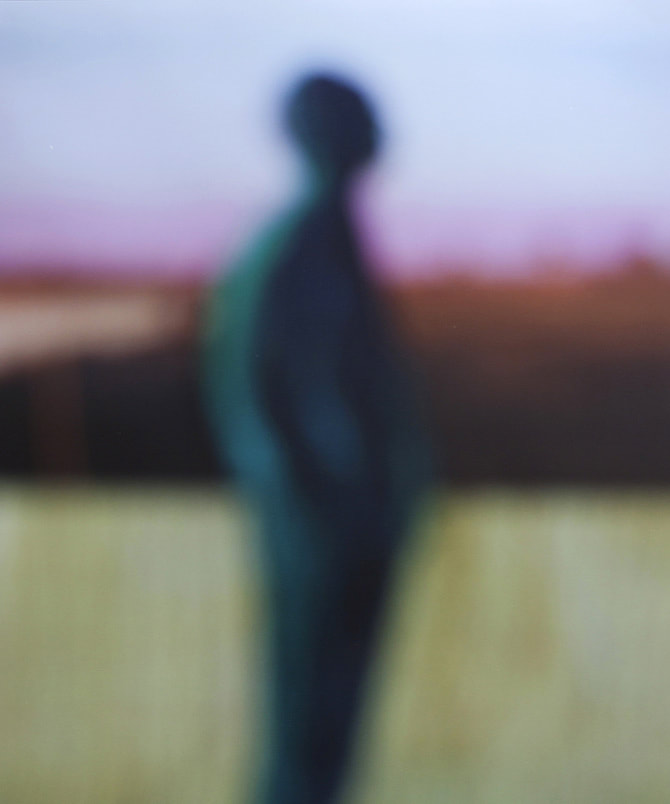
At this point in the assessment for abstraction, we need to research two photographers, and one of them is Bill Armstrong, he is an excellent abstraction photographer as most of his work is blurred with lots of light and the least amount of focus then a photographer would use. Thought his entire work there are a range of tone from light to dark some have a silhouette with a brighter light behind it as to make the silhouette stand out as the contrast is complementary to the photo there are others that are a blurry form of a drawing in a story. The light for those types are usually bright, overall my favourite from the work he has done is film noir (Two of the images from the work are below.) I enjoy looking at these because of how the area around the silhouette seems to be random one, and how the colour stands out for both the background and the silhouette.
Another I chose was Anouk Kruithof not because of how well she did it but the thought process behind it. What she did was something meta, she put a bunch of photos and gave out mirrors so that people could "frame and focus on the images" this gives people who don't normally take photos have a feel and get a sense of how it could work well.
Akihiko Myoshi is a contemporary photographer who focuses on the mixture between technology and art, his photography is taken with an old camera which is interesting. The way that he made this picture is lighted with those colours is by putting tape of different colours over the camera lens. Some of his abstract pictures are much more colourful than others but they all use mirrors to show how he is taking the photo some of them are edited after but a few of them are unedited
Akihiko Myoshi is a contemporary photographer who focuses on the mixture between technology and art, his photography is taken with an old camera which is interesting. The way that he made this picture is lighted with those colours is by putting tape of different colours over the camera lens. Some of his abstract pictures are much more colourful than others but they all use mirrors to show how he is taking the photo some of them are edited after but a few of them are unedited
Photograms
Dafna
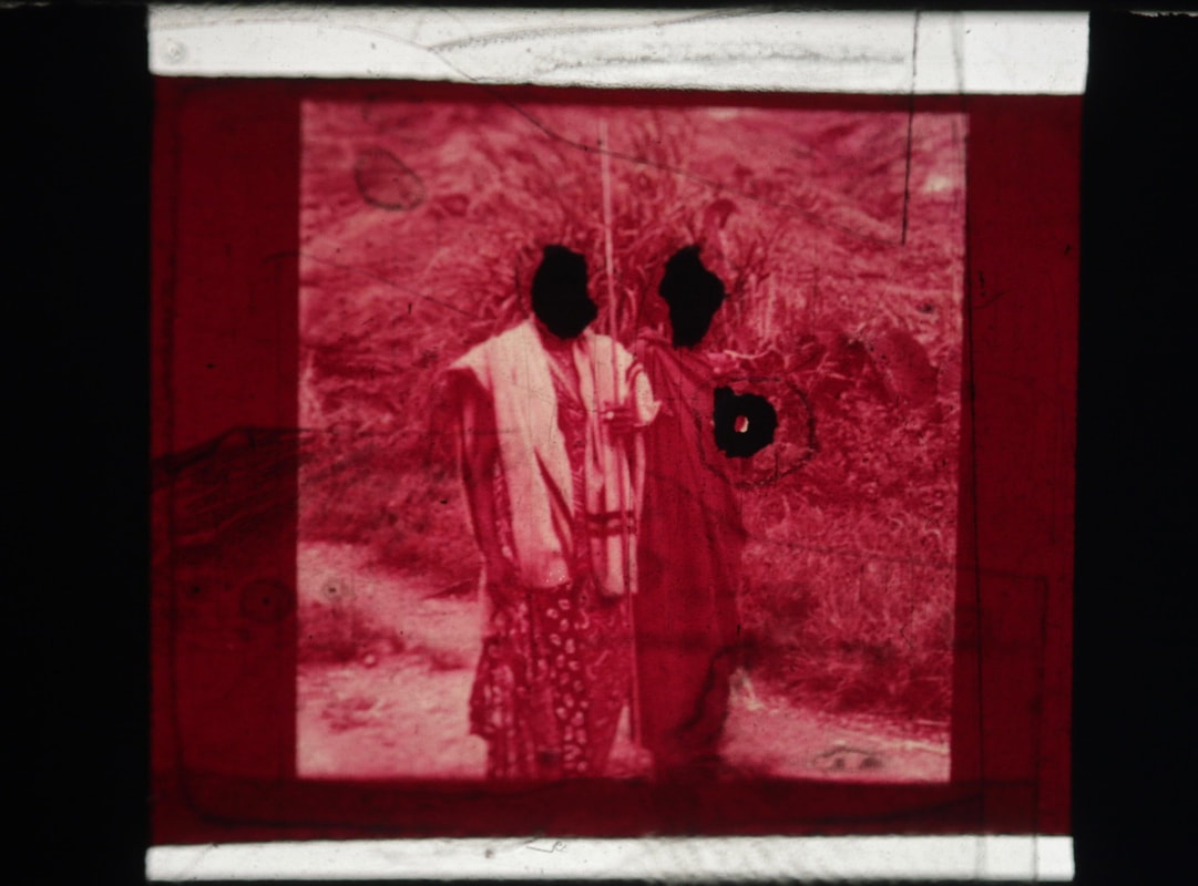
Dafna, when she was growing up did a lot of moving around places and travelling, but she always took her camera as a way to keep memories of every place she has been to, with her to the point that she had piles of boxes filled with photos that she was unsatisfied with that were neglected from any artistic function. However, what she thought was initially the idea of frustration and disappointment led to the idea of creating and joining different places with a certain personal meaning to create an "idealised and utopian landscape" She describes constructed landscapes as 'Constructed Landscapes transforms colour negatives of landscapes initially taken as mere keepsakes through the act of slicing and splicing. The resulting photographs allude to an imaginary place.
Evaluations
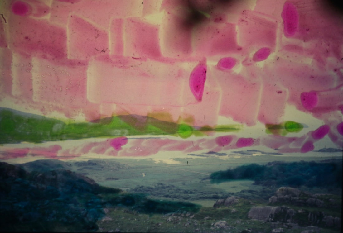
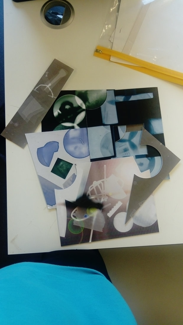
The assessment of this theme of abstract, the way I think it should be is to lay the images on top of each other cut up and then which ever fit but the image has to be full of colour and not have an inherent frame as to not be similar to many photograms for it to be also different I want to give it a more colour as to make it brighter with some very bright images and very dark images together in an unusual way to make it more abstract.


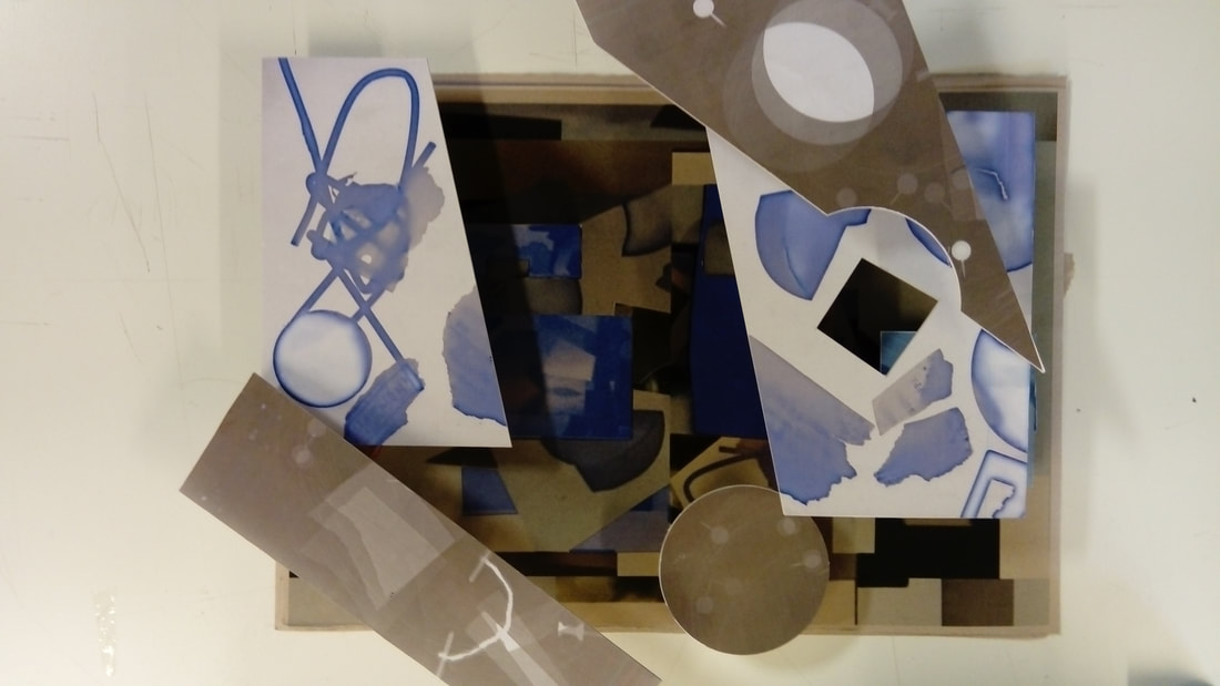
These are images I chose to use by making them in the dark room during the assessment I put all the photograms I made during the assessment on the photograms title on top of this section of the page I used photoshop to change all but one image to give a more colourful and diverse range of images as to make it as confusing and abstract as possible I used more strange methods such as adding a light effect for an image and changing the entire image colour set.
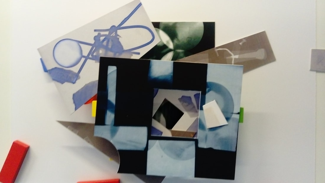
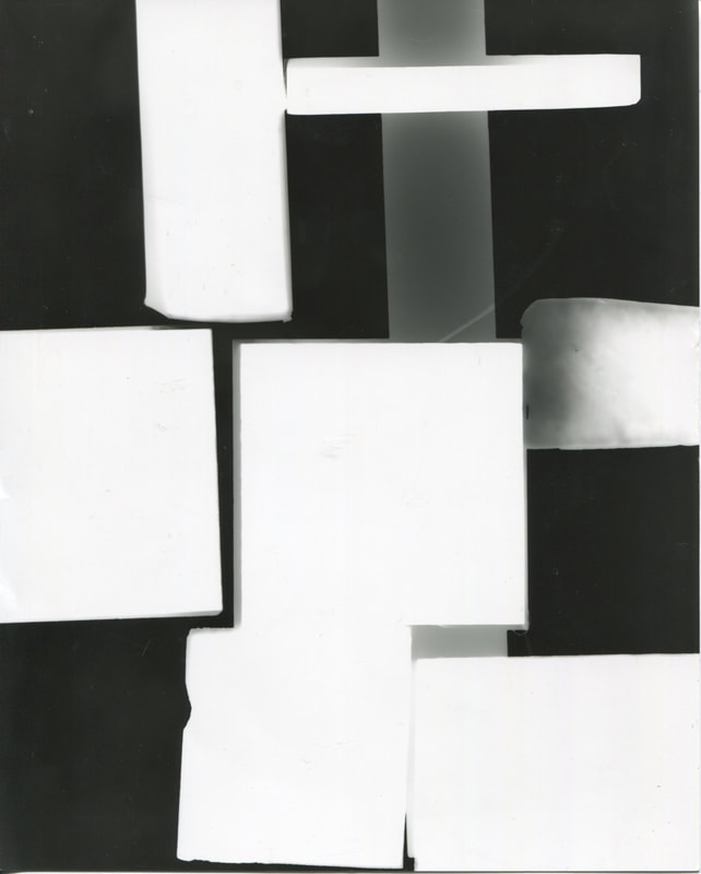
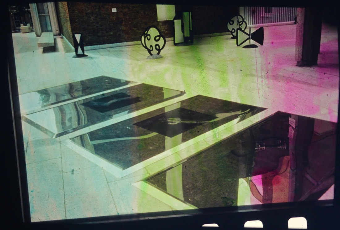
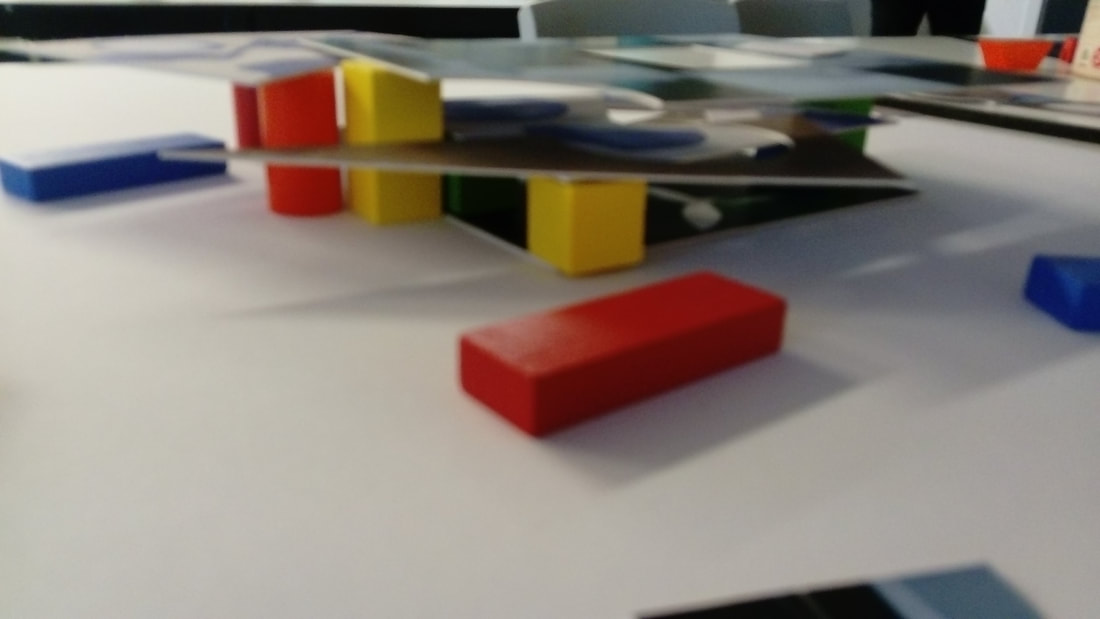
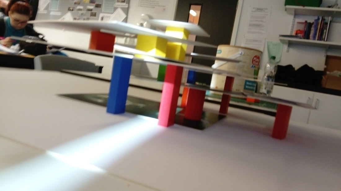
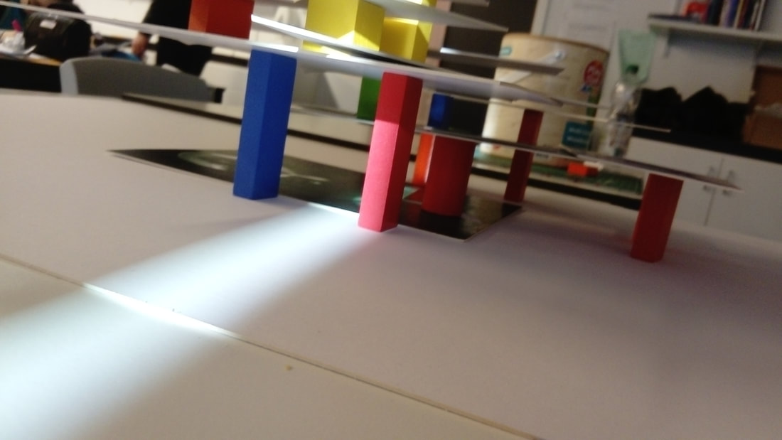
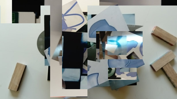
After experimenting with the images and blocks I had been happy with the results the image with the camera was the first image as it was uncut it started out at a level of satisfactory so to go a bit more of an above then neutral level to a more become something more of an oddity so it had been cut and a couple had holes in the middle to become see through to have a sense of another frame within the sculptures so I had an image within a sculpture so I had made an image within the image and in one of them I had another image within an image within another image and I noticed to make it pleasing the images each time had to become smaller to show part of the frame but the images sometimes and two frames in the same level without being an image within an image within an image but using the building blocks can be limiting as they have weight stacking more then 4 layers becomes a game of Jenga and not trusting the people around the sculptor to breath next to it so balancing is key however that does allow me to think of how creatively to place it and how to change it will change the future placements as it shows below.
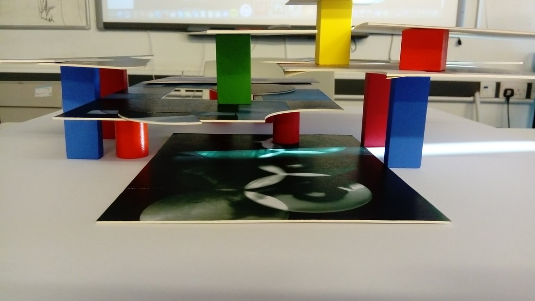
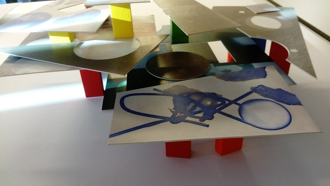
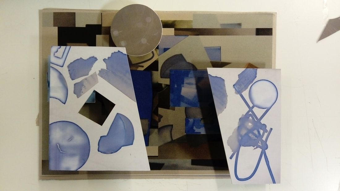
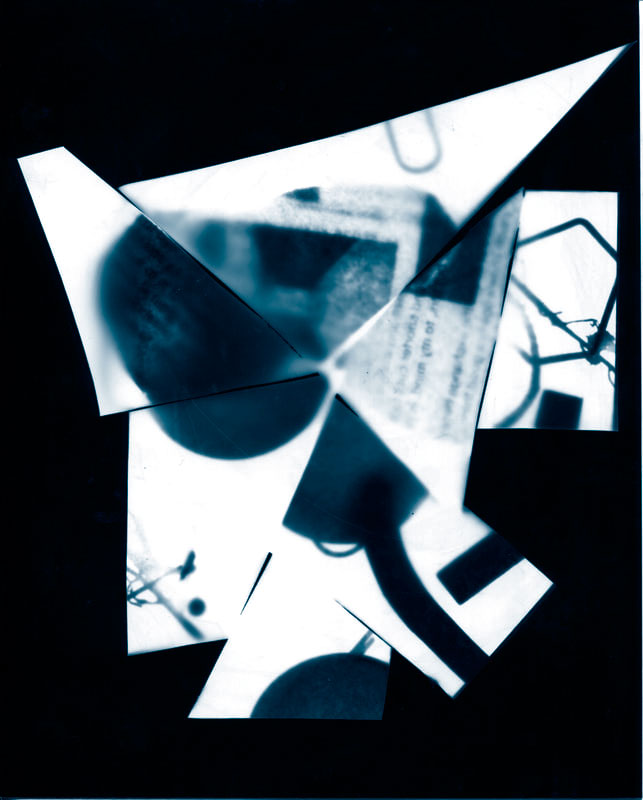
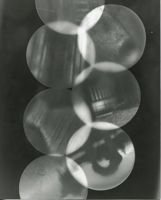
Then I had built upon it with a more blue-tinted version of it as I had rearranged it again on-top of the blue photo as it had Been to add another layer and to create more openings it would make some parts of the previous photo with a variety in colour which can give people a more pleasant feeling towards the photo.
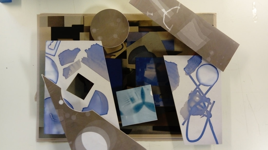
Final Product
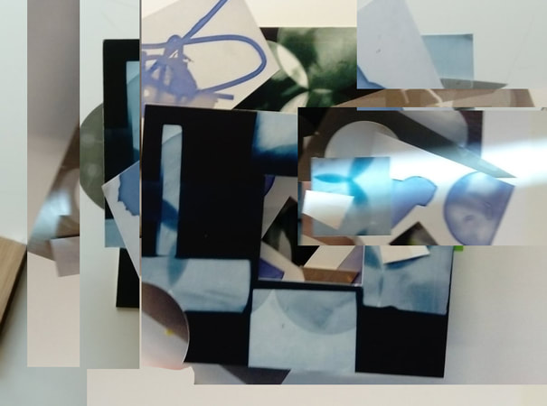
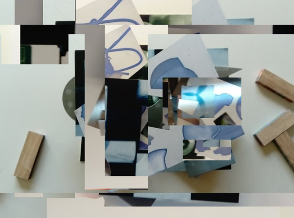
At this point I had made a mix of layers and openings to my pictures that I had thought would be similar to what bill Armstrong did with quite a blurry photo as he had bright photos with dark colours either being in the side or In the focus.