The Choice of Colour
Daroo Photography, Jacob Reischel and Matt Russell produce still life photographs where choices about colour strength and contrast are very important. Martin Parr and Alec Soth carefully consider the colour of props, clothing and background in their documentary studies of people and places.
Study appropriate sources and produce your own work where the choice of colour is important.
Study appropriate sources and produce your own work where the choice of colour is important.
I have selected "The choice of colour" because instead of having only just "colour", it contains the option and the selection of what contains colour or does not contain colour. This enables me to develop surrealistic photographs. I have explored the fields relating to colour before and have implemented it as a subgenre in previous projects. By choosing "The Choice Of Colour" I will be capable to enhance and expand my ability of this theme to produce photos that show contrasting tones and surrealism.
Questions I need to ask myself is
Questions I need to ask myself is
- how could I use colour to affect senses, what combinations work together?
- how effective is colour theory?
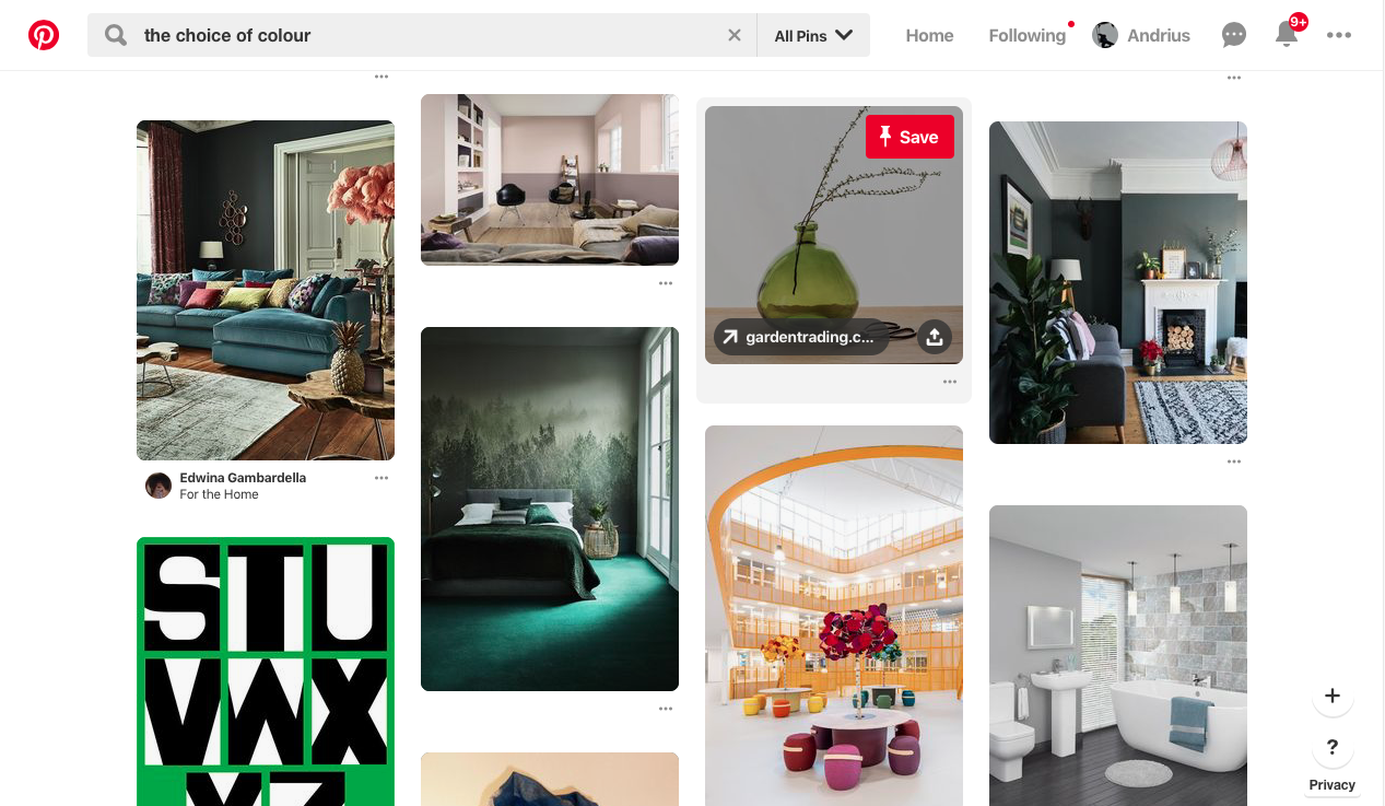
by checking Pinterest on the theme, it seems that one of the most done thing is to place very bright colours in darker areas, however these photos are mainly made with a lot of resources and require the use of an entire room, there are some photos that don't require the use of large resources and these are the types of photos I'll try to be using.
Daroo Ulises
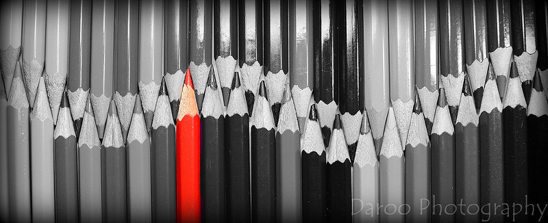
Daroo, as a photographer seems to have done many close ups of very colourful and varied objects such as pencils (of which he has used in many of his photos) the concept he seems to have looked at may have done something with colour as he has many photos with one shade of colour or many different colours, awhile also maintaining a pattern or recognisable shape, many of his photos seem to embody a very bright lightening with high contrast.
I believe i will use the idea of using a single tone of colours to show a photo from Daroo as he shown it can be effective
I believe i will use the idea of using a single tone of colours to show a photo from Daroo as he shown it can be effective
Experimentation #1
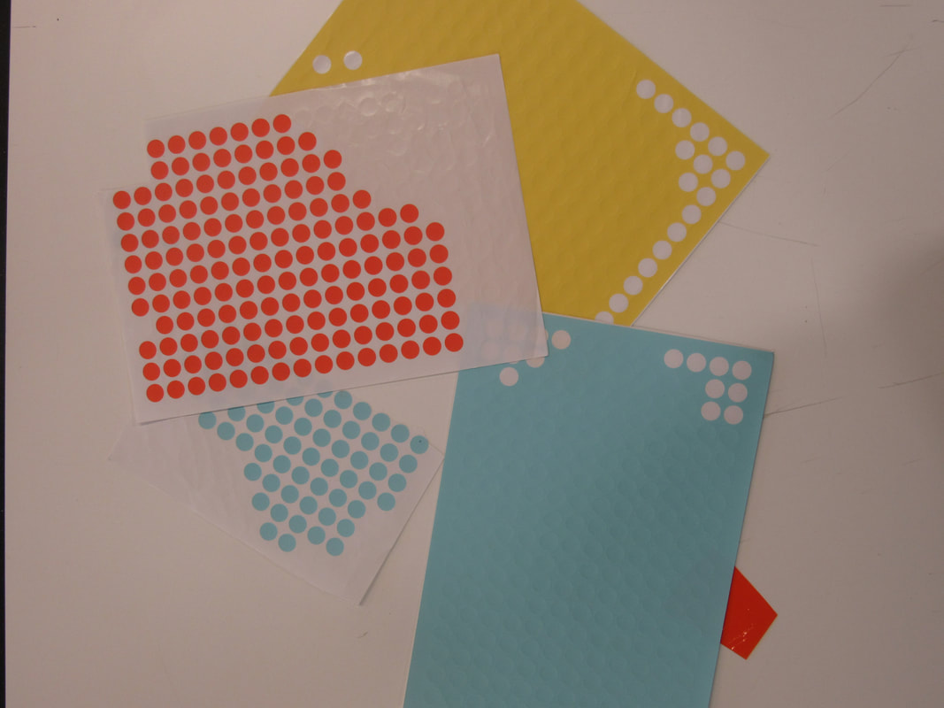
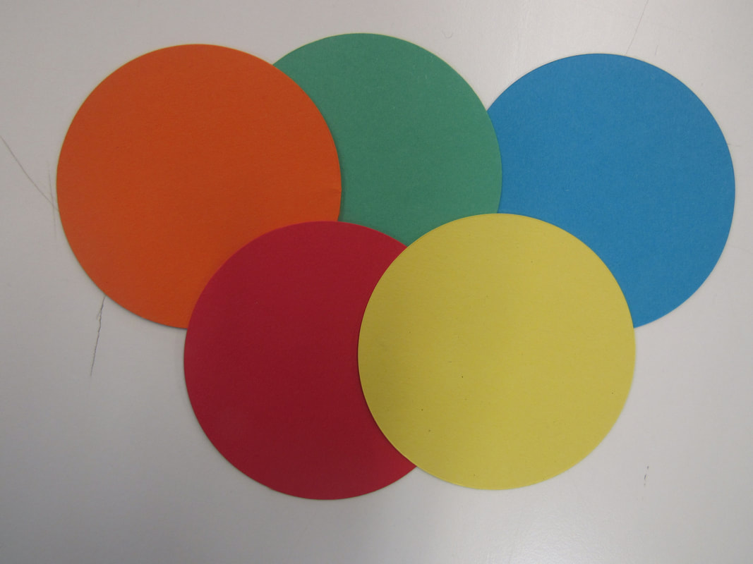
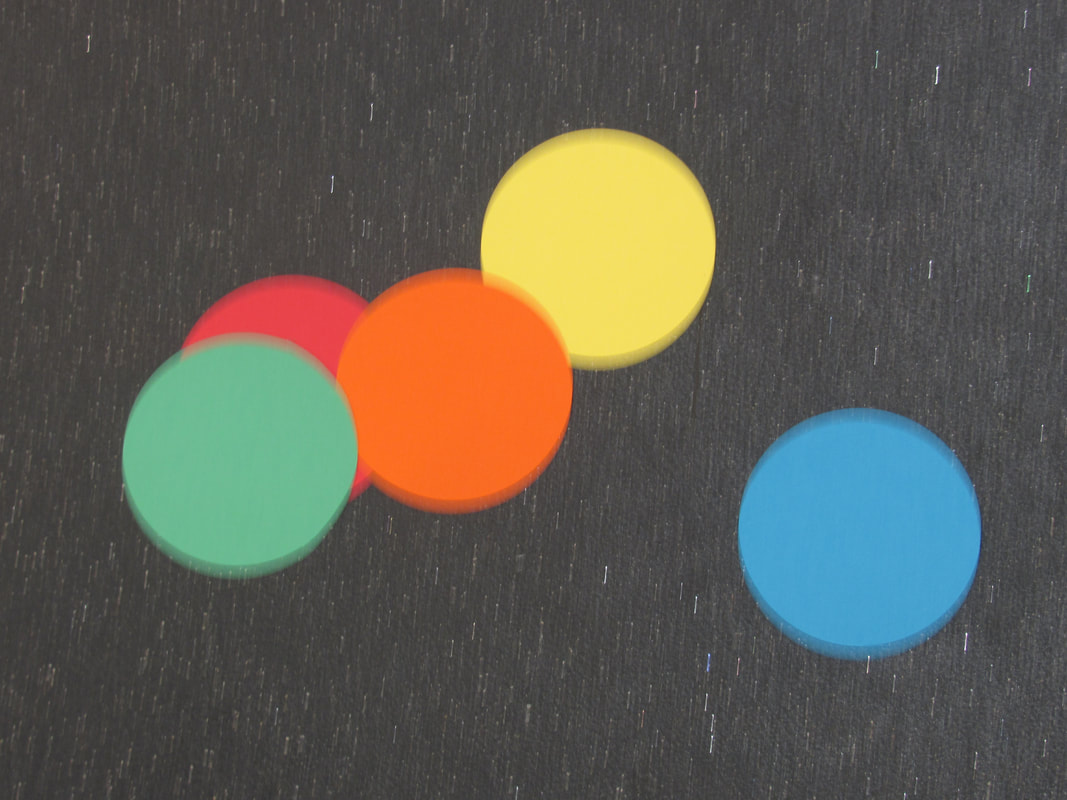
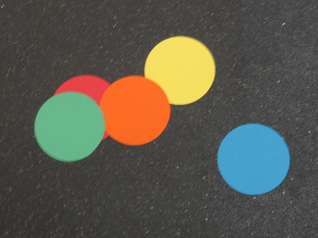
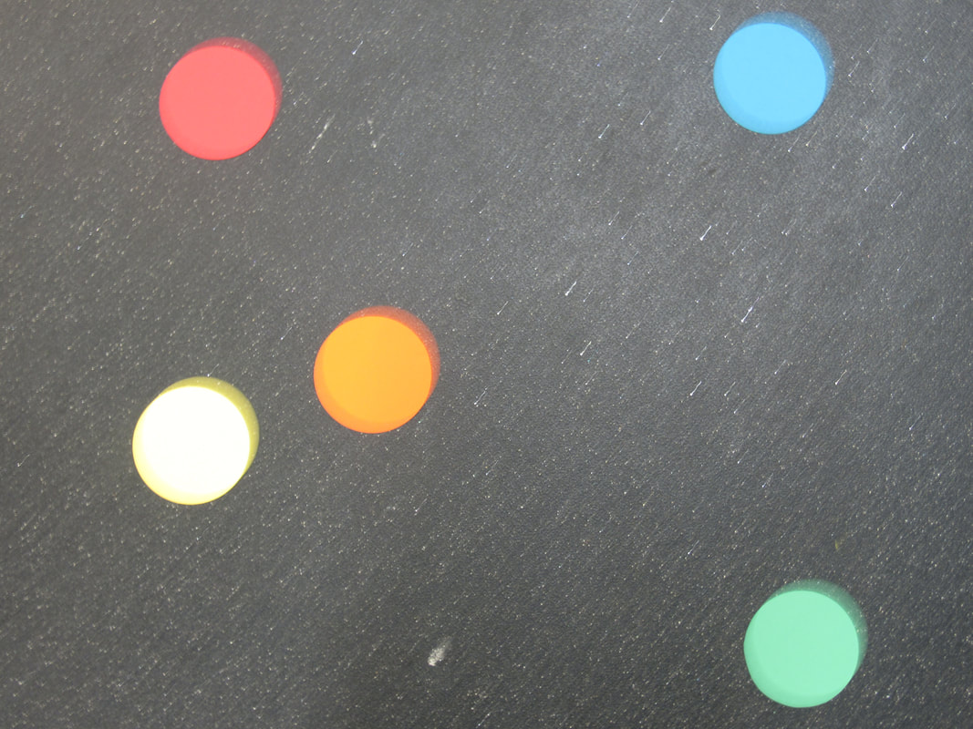
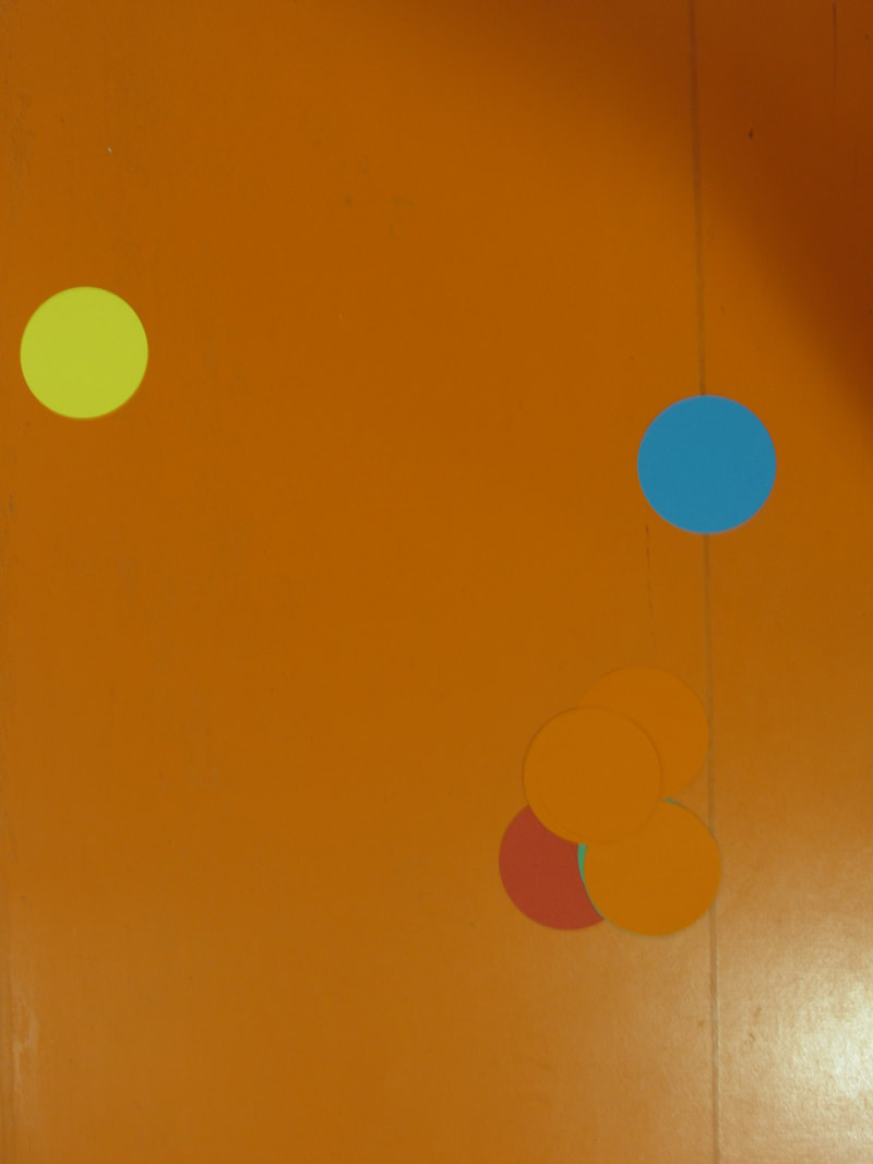
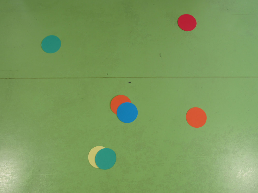
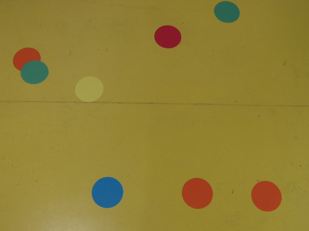
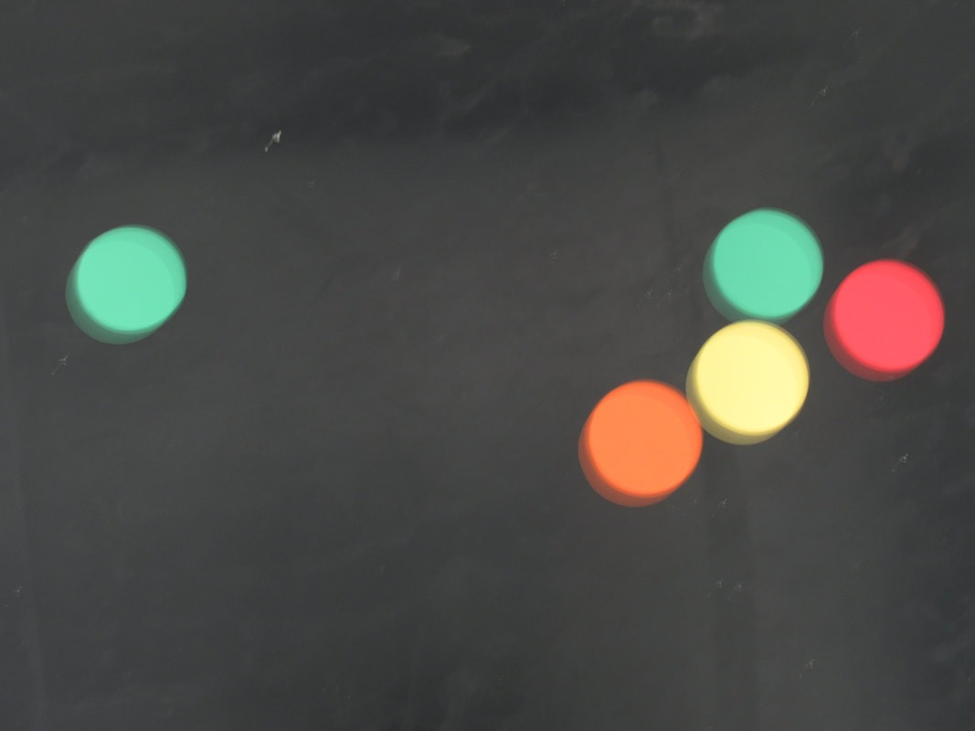
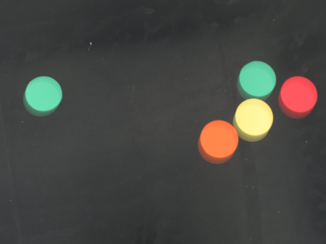
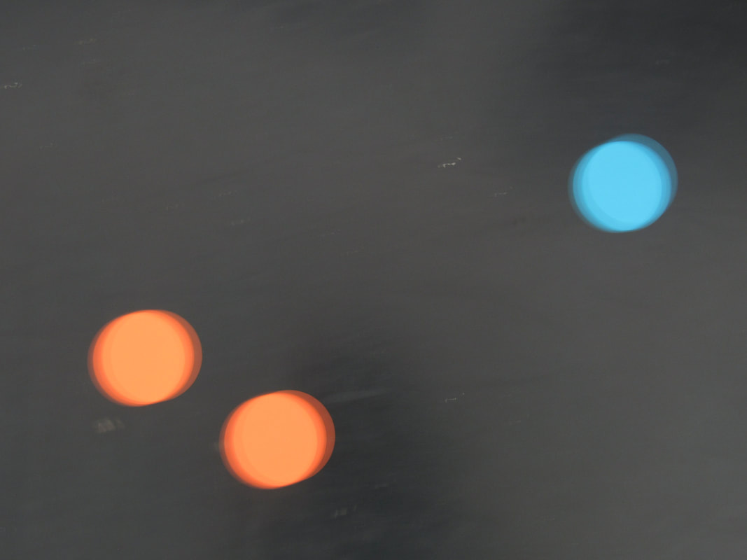
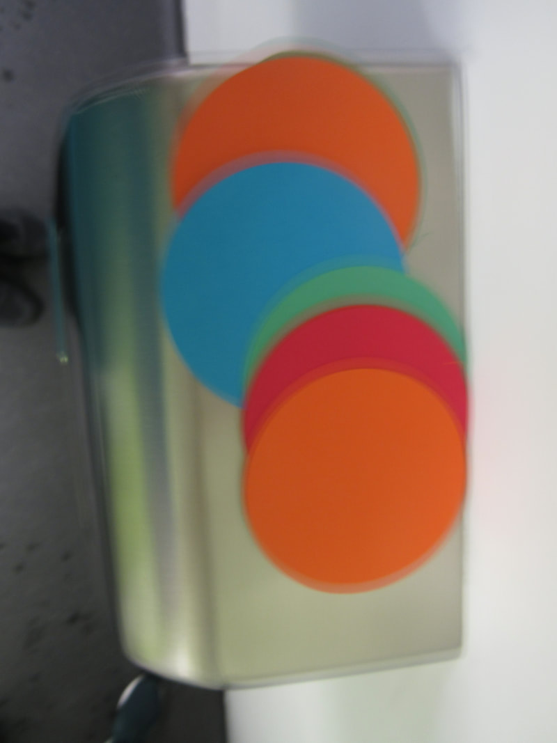
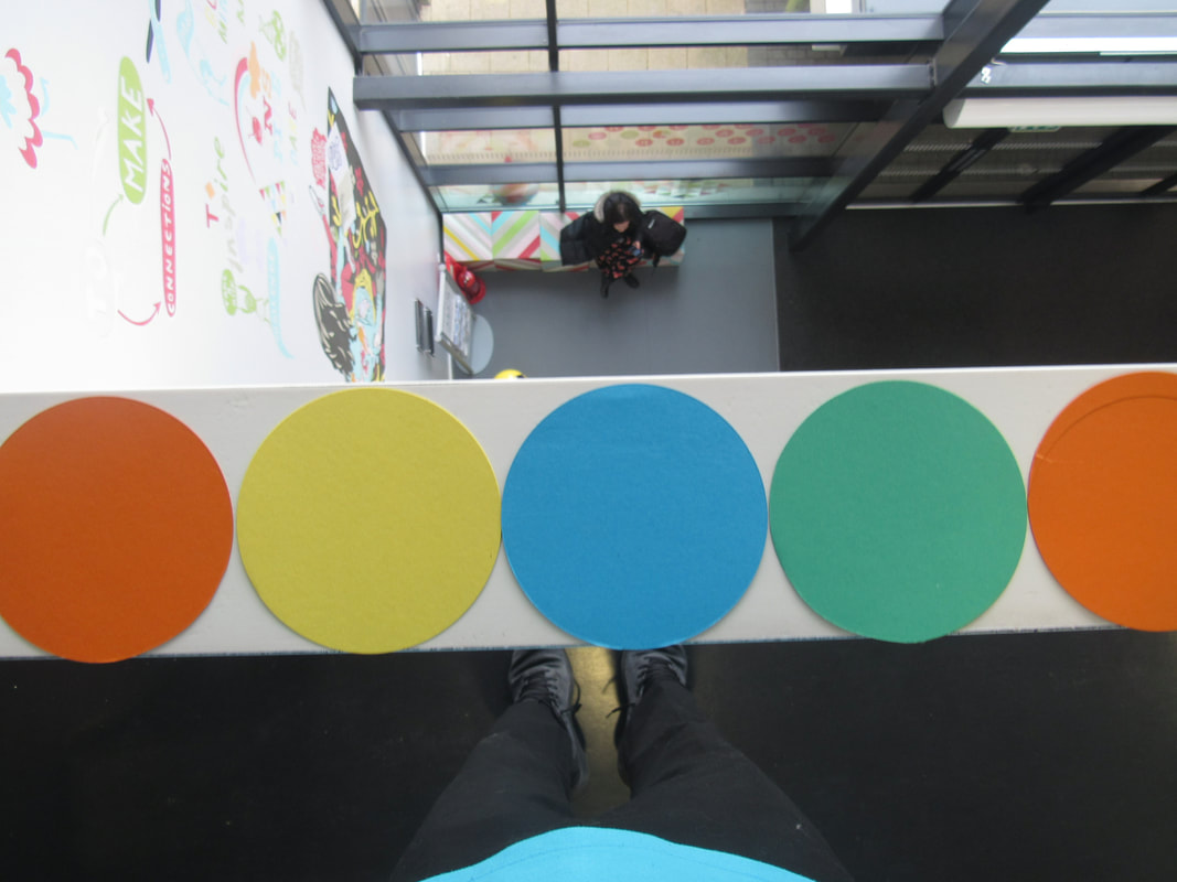
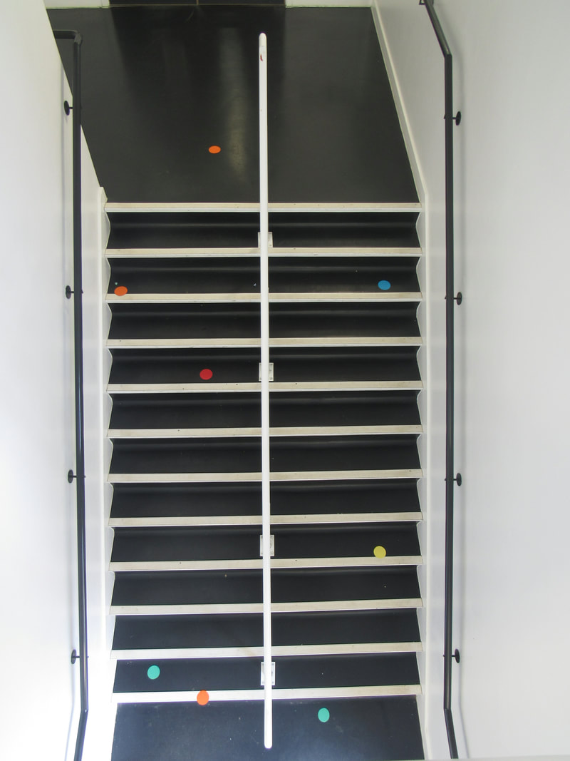
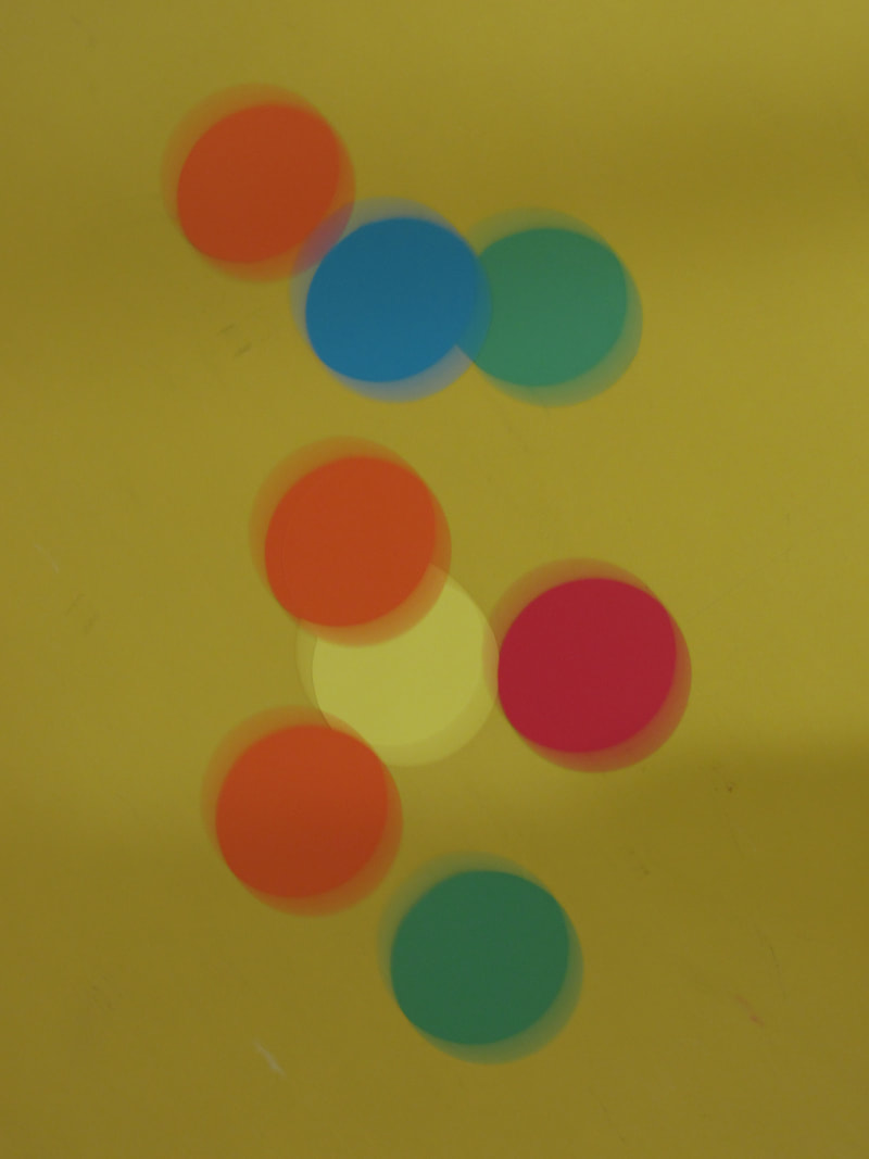
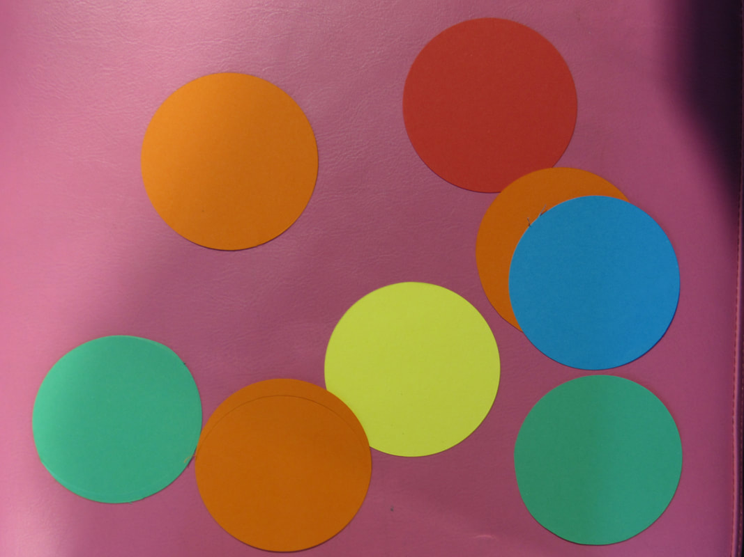
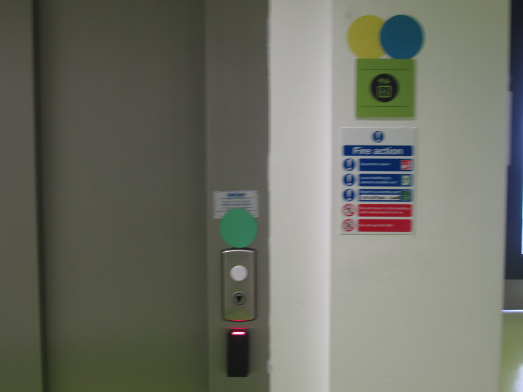
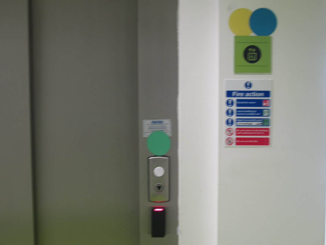
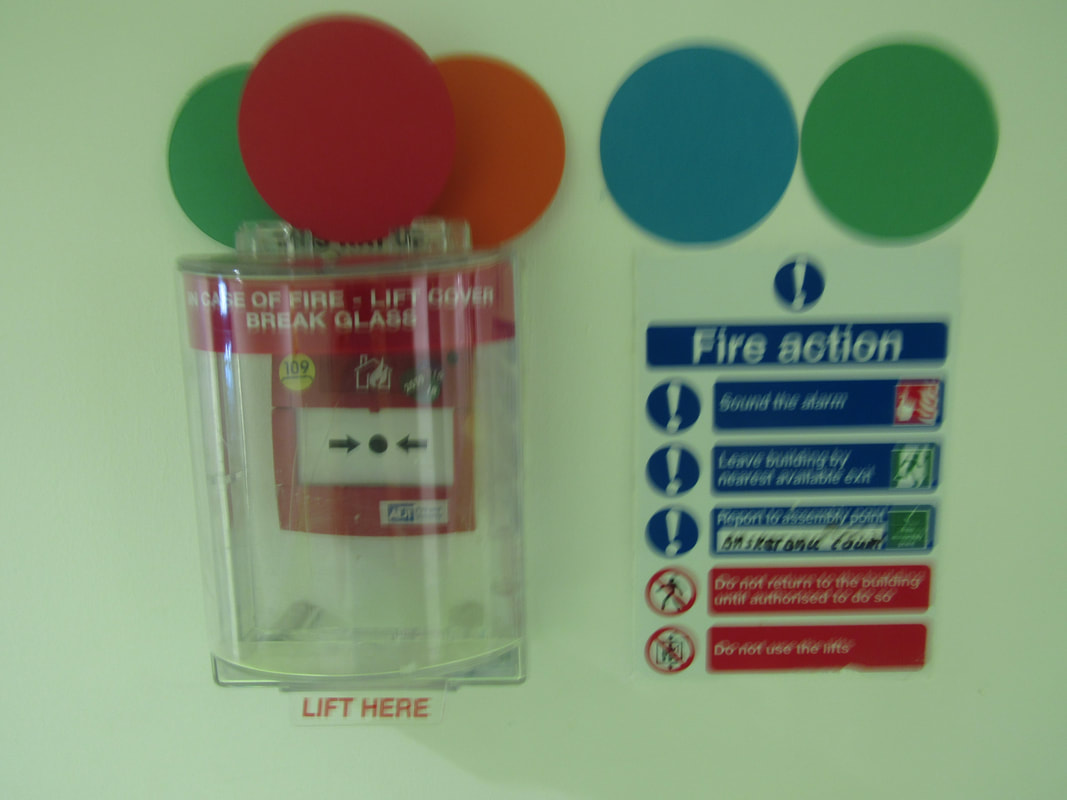
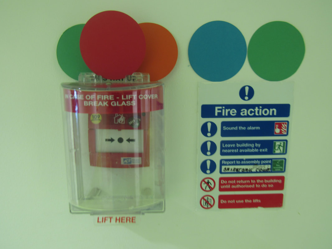
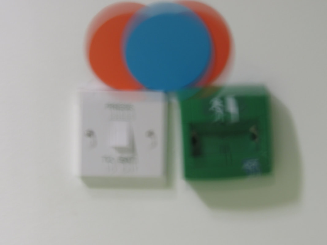
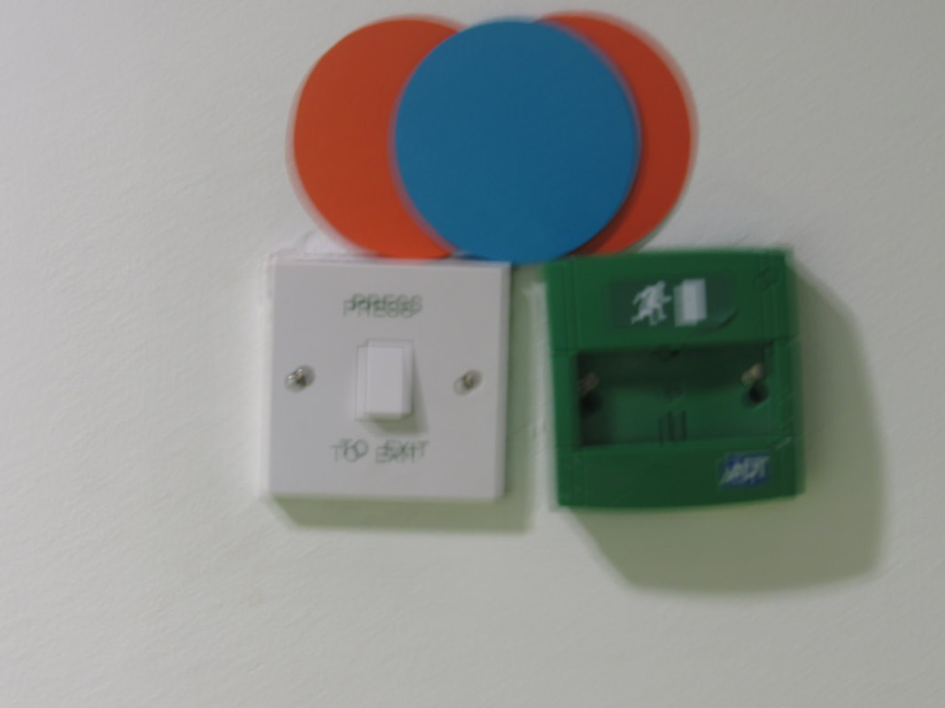
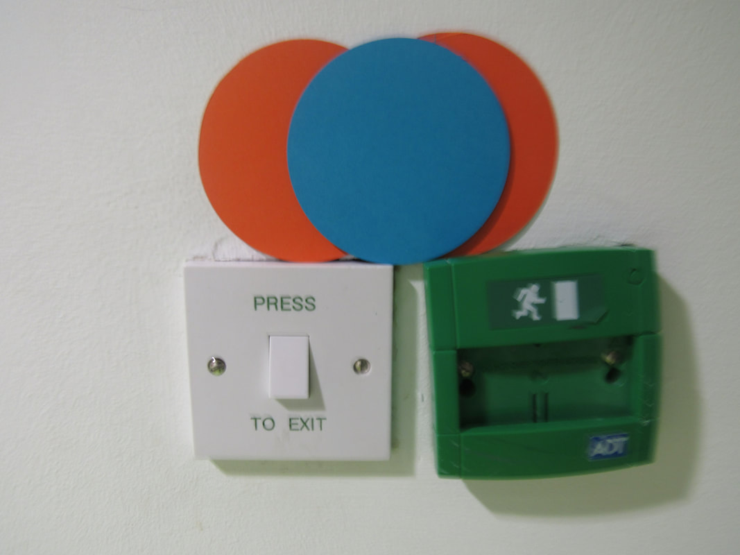
At the beginning of the shoot I was carefully placing the circles so it had a thoughtful layout, but at a point I thought about the absence of choice in how it's laid out, so I started throwing the circles in random spots and rotations so it wouldn't all look the same, then I experimented with the environment and strange places.
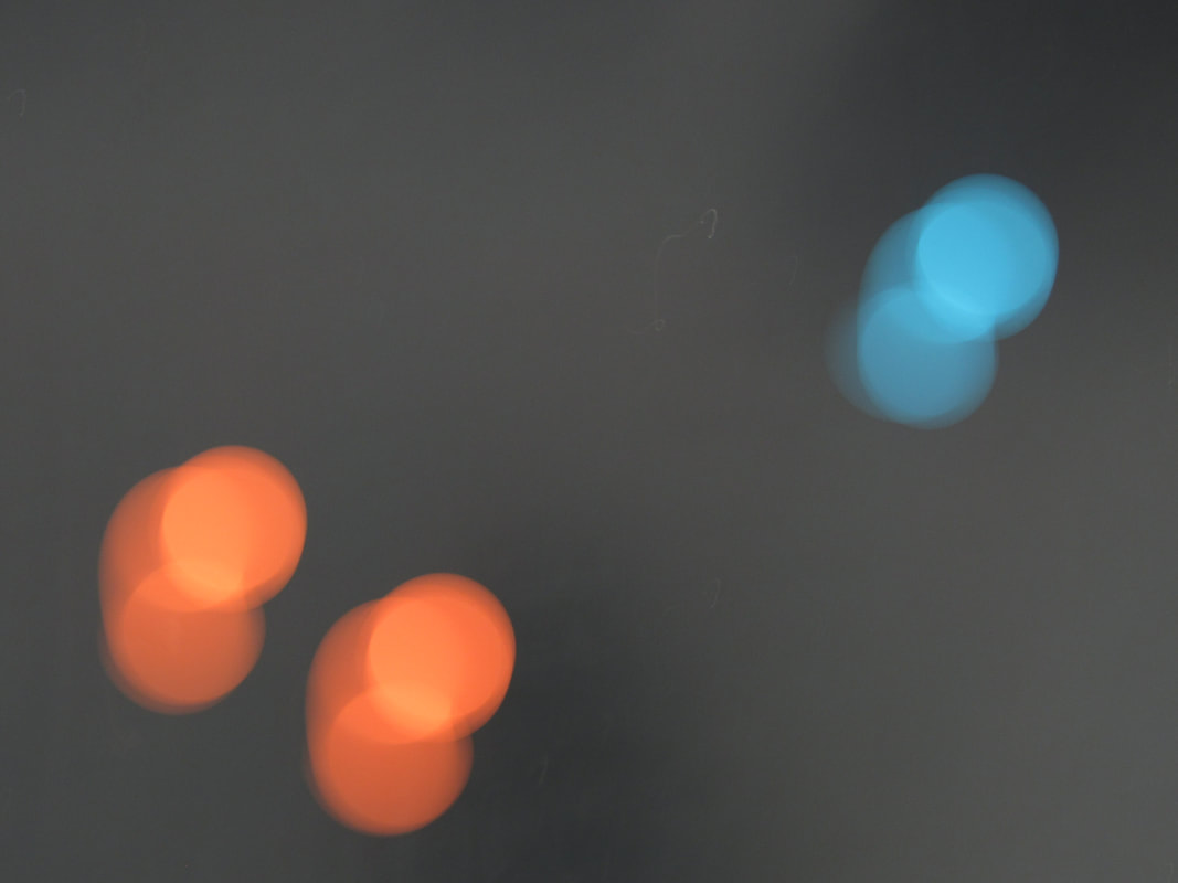
Attempting to make a .GIF
this is only an attempt at making a gif and may implement it into the 10 hours of work if I would require to do that, this is only and test and to see if I am able to make one, so this won't relate to the theme but just a test on how well it works and if it is worth time and effort to create.
Within photoshop, I am unable to make such a GIF due to getting "Error 22" I will have to attempt creating a GIF in another method such as a phone app at another time.
Attempt 2
I made this in a general gif to test out how to make one, it seems to be too lengthy of a process to allow for a syncing in the pictures to provide a fluid motion to represent the 'choice of colour', so I doubt I would use this but I will keep it in mind when making a plan for the 10 hours
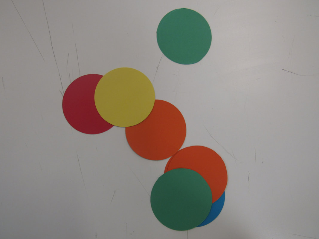
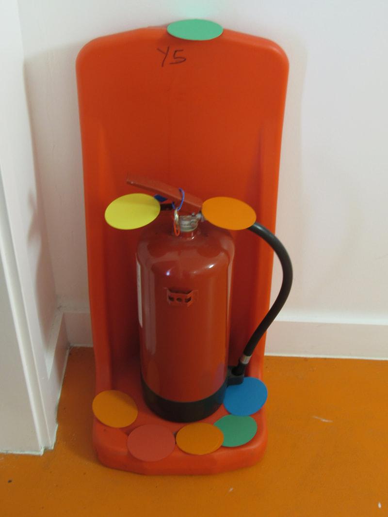
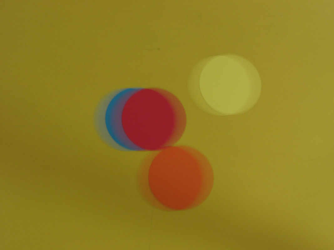
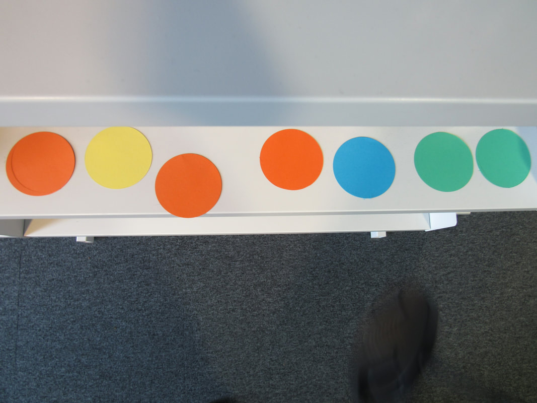
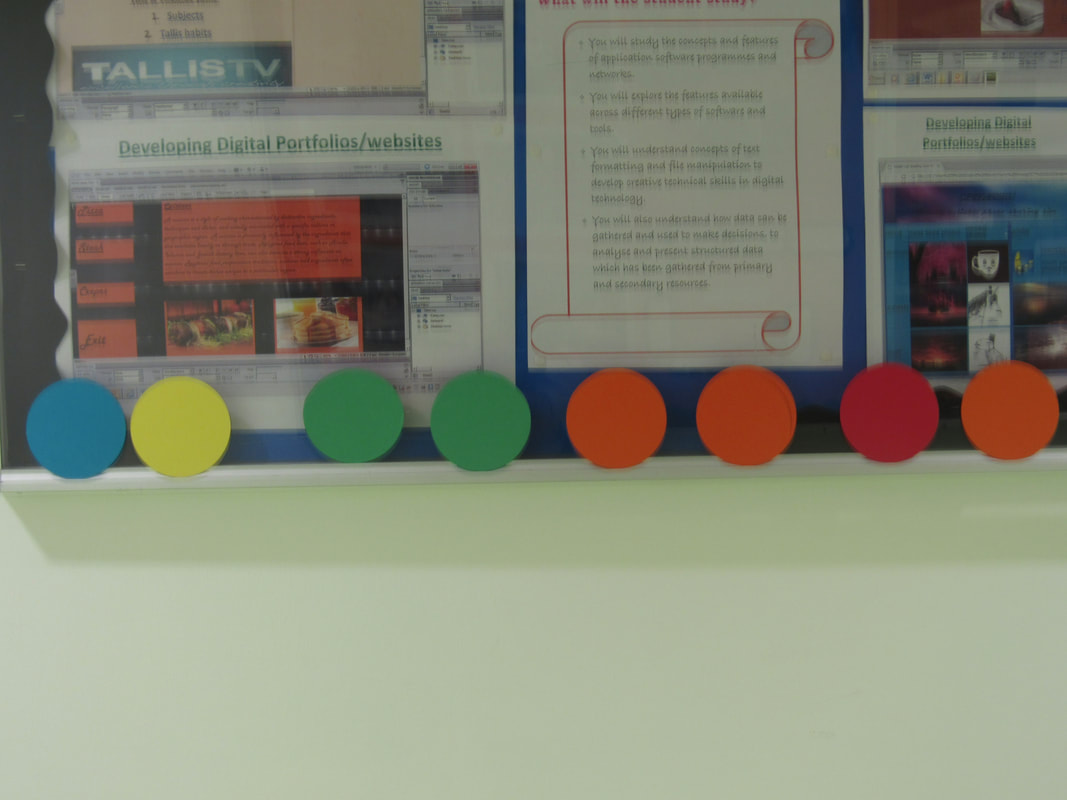
Last Photo-shoot
Within this photo-shoot I wanted to get the final images that I needed for my idea for the end piece, my idea is to print out these pictures but in different colour tones from the printer settings and then to cut up the pieces so that they form together in different colour'd tones to be one picture, this seems like a fairly easy and quick process so I'd like to redo this many times in upward of around 10 pictures but that might be a high estimate, so I think the likely amount is five or six.
10 hour plan
1. Create a PowerPoint in a USB print out coloured papers
2. Decide which pictures I want in the final piece
3. Print out coloured photos
4. Cut up Decided pictures and put them back together
5. Check through pictures
6. Write a evaluation for how the 10 hours and the time spent before the 2 days
7. Hope for the best
2. Decide which pictures I want in the final piece
3. Print out coloured photos
4. Cut up Decided pictures and put them back together
5. Check through pictures
6. Write a evaluation for how the 10 hours and the time spent before the 2 days
7. Hope for the best
